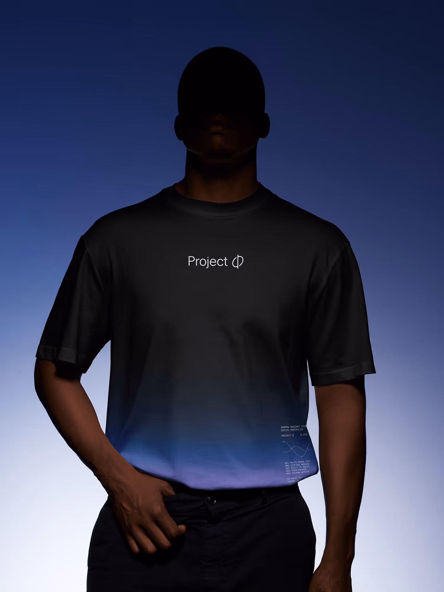
Project Ø
Unifying Fragmented Assets Into a Single, Seamless System
Project 0 is a next-generation DeFi solution built on Marginfi that allows users to borrow against their entire on-chain portfolio across multiple protocols. By unifying fragmented assets into a single, seamless system, Project 0 enhances capital efficiency and flexibility for both professional traders and everyday users.

Bringing Clarity to the Chaos of DeFi
Project 0 approached us with the goal of creating a brand identity that feels sophisticated, progressive, high-tech, and secure → a direct reflection of their product. They wanted to communicate clearly what they do and what they stand for, while distancing themselves from the speculative and low-quality image often associated with parts of the crypto and DeFi space. The challenge was to express trust, innovation, and technical excellence through a visual language that would resonate with a discerning, professional audience.


Translating Innovation Into Visual Language
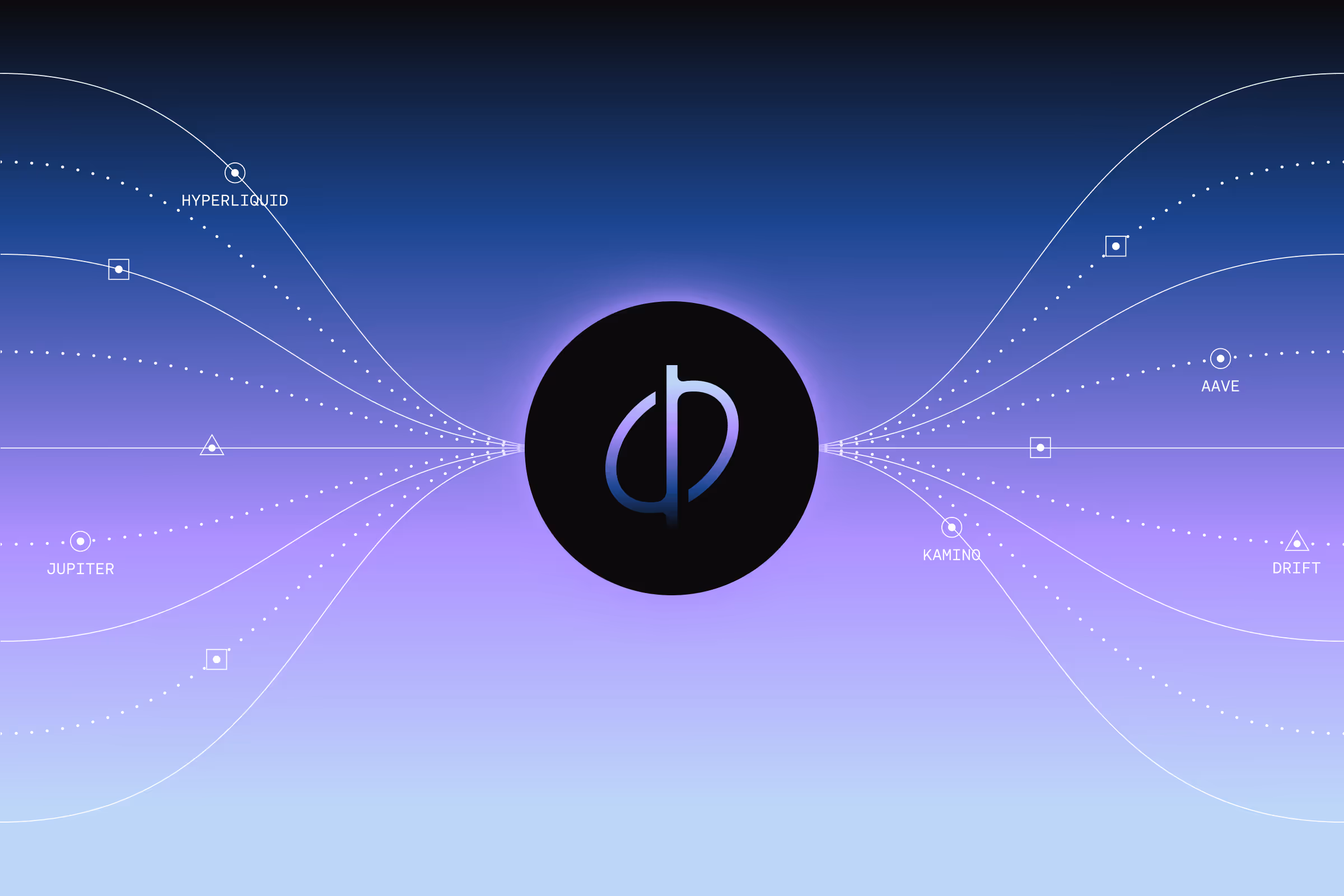
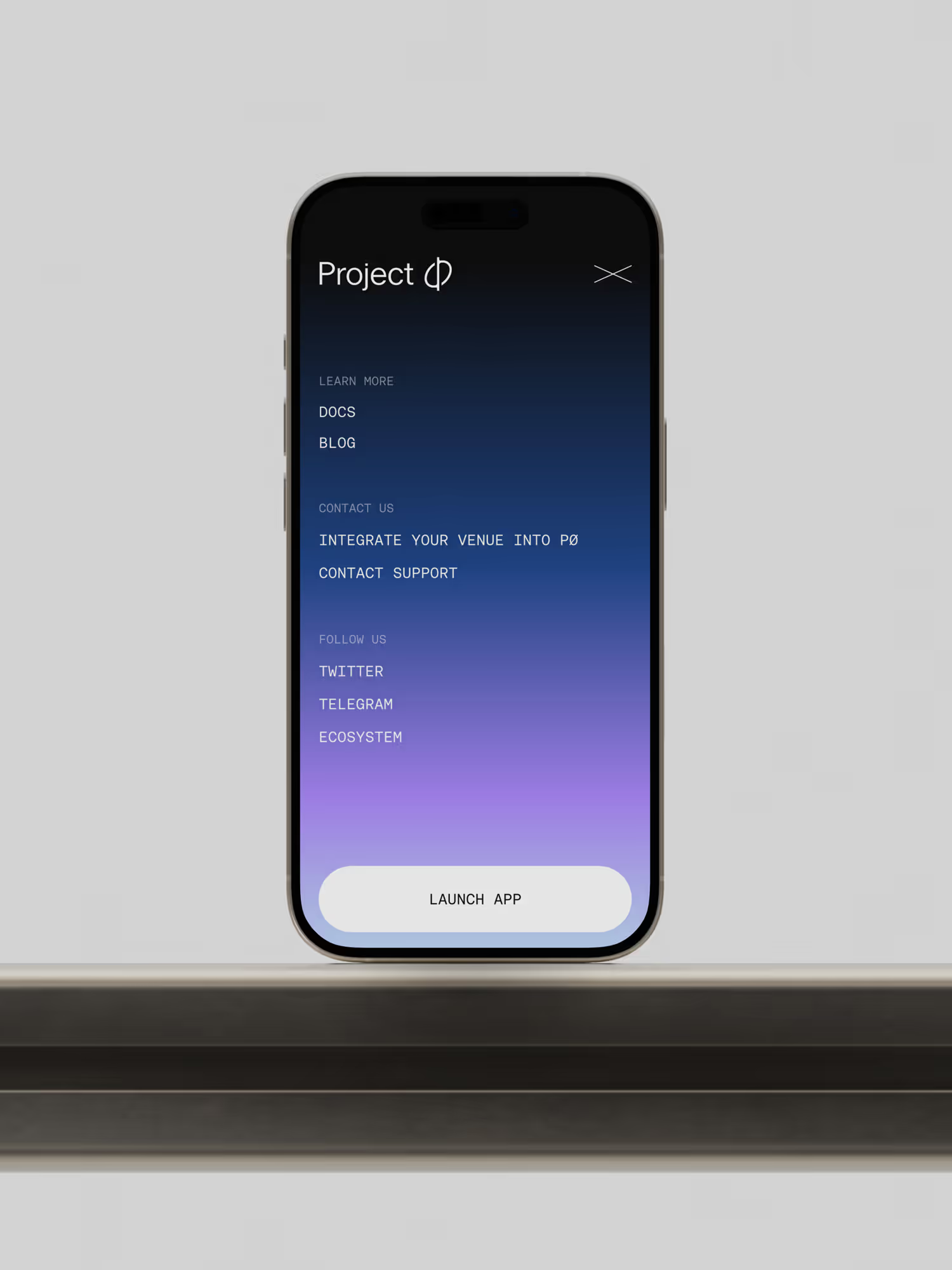
As Project 0’s main innovation lies in the unification of assets, we set out to capture that idea within the symbol: the most recognisable and widely used element of the identity across documentation, trading terminals, SDKs, the app, and beyond. From there, our focus shifted to building a cohesive visual foundation: selecting a versatile type system rooted in a high-tech aesthetic, developing a distinctive colour palette that adds energy and edge, and creating a graphic system capable of translating the abstract ideas of DeFi into clear, comprehensible visuals.
Building a Visual System Around Singularity
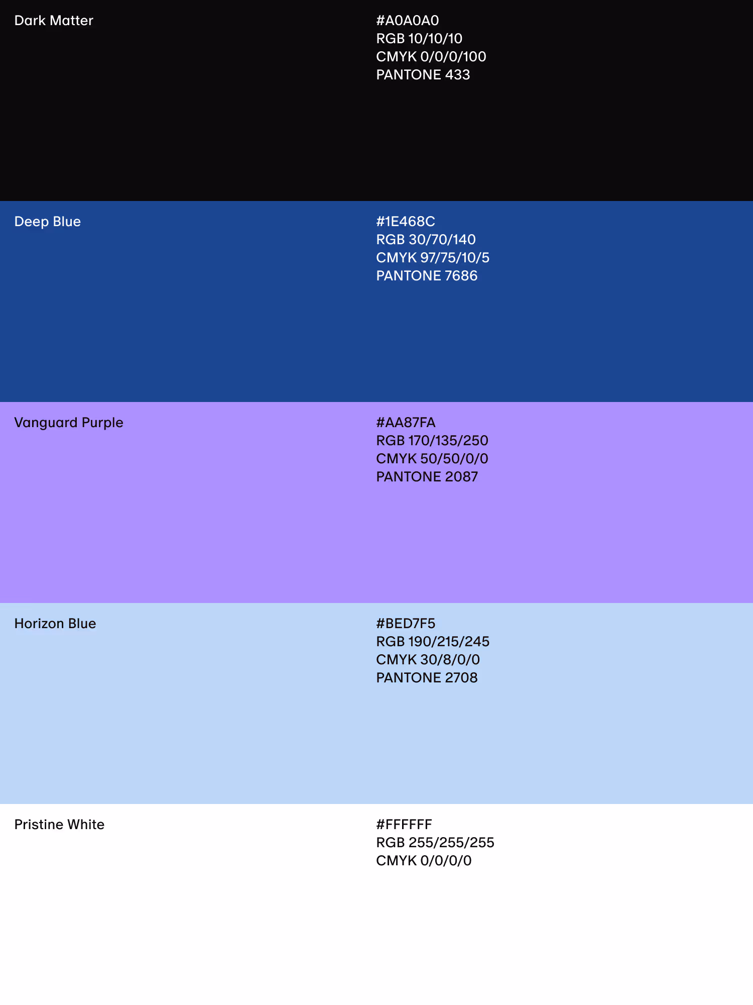
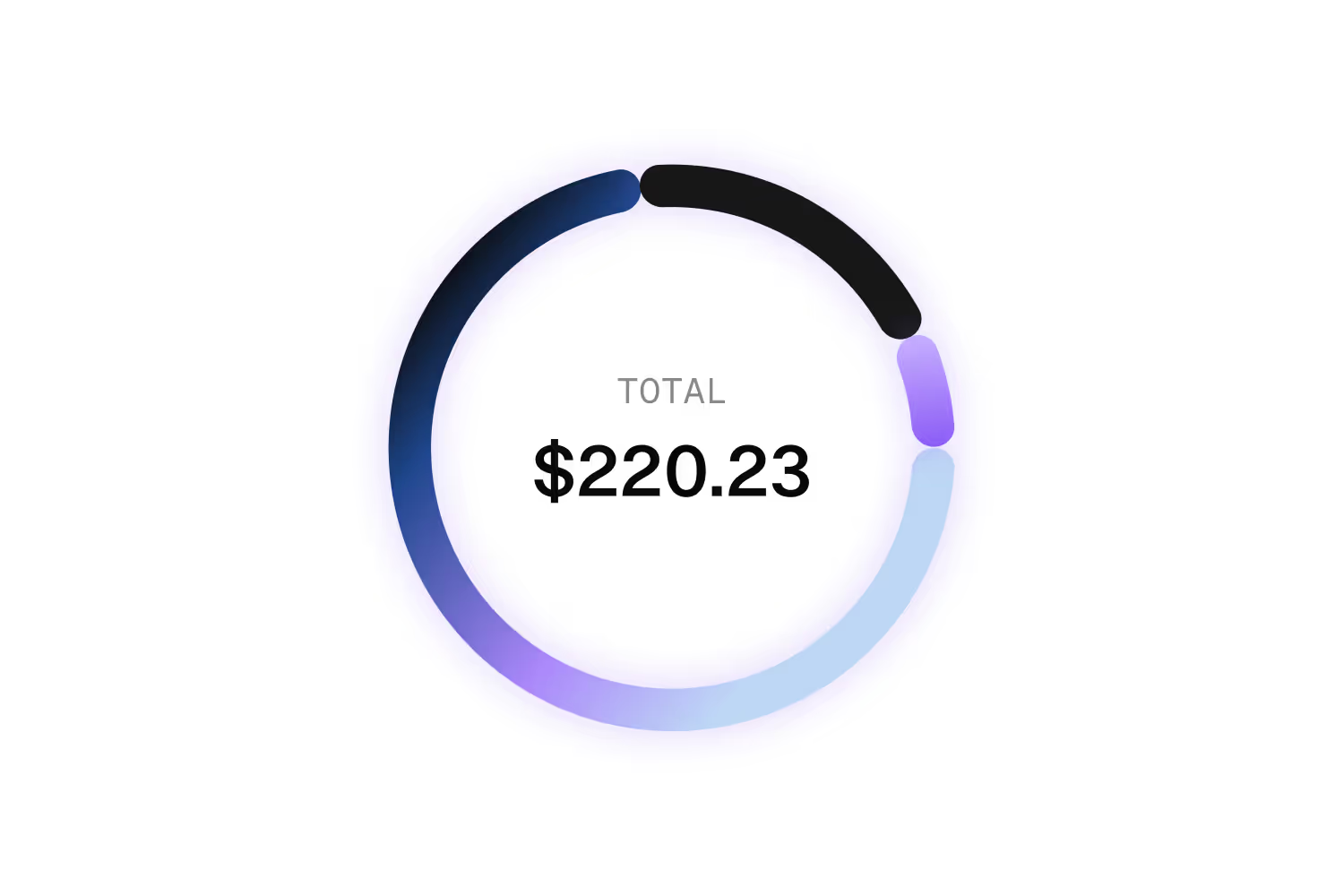
The final identity centers around a symbol inspired by a black hole, representing unification and singularity — the key principles behind Project 0’s technology. This visual metaphor aligns with the brand’s futuristic narrative and establishes its high-tech, forward-looking personality.To support the symbol, we selected a clean sans-serif typeface with a modern, trustworthy presence, paired with a monospaced secondary typeface that adds technical precision and evokes the world of high-level coding. The color palette, derived from a blue-purple gradient, brings a sense of depth, energy, and cosmic sophistication to the brand.The illustration system draws inspiration from coordinates, technical plans, and engineering schematics, adding structure and detail while helping translate complex DeFi mechanisms into an intuitive visual language. Together, these elements form a cohesive identity that communicates clarity, innovation, and trust, turning a highly technical product into a brand that feels both accessible and advanced.