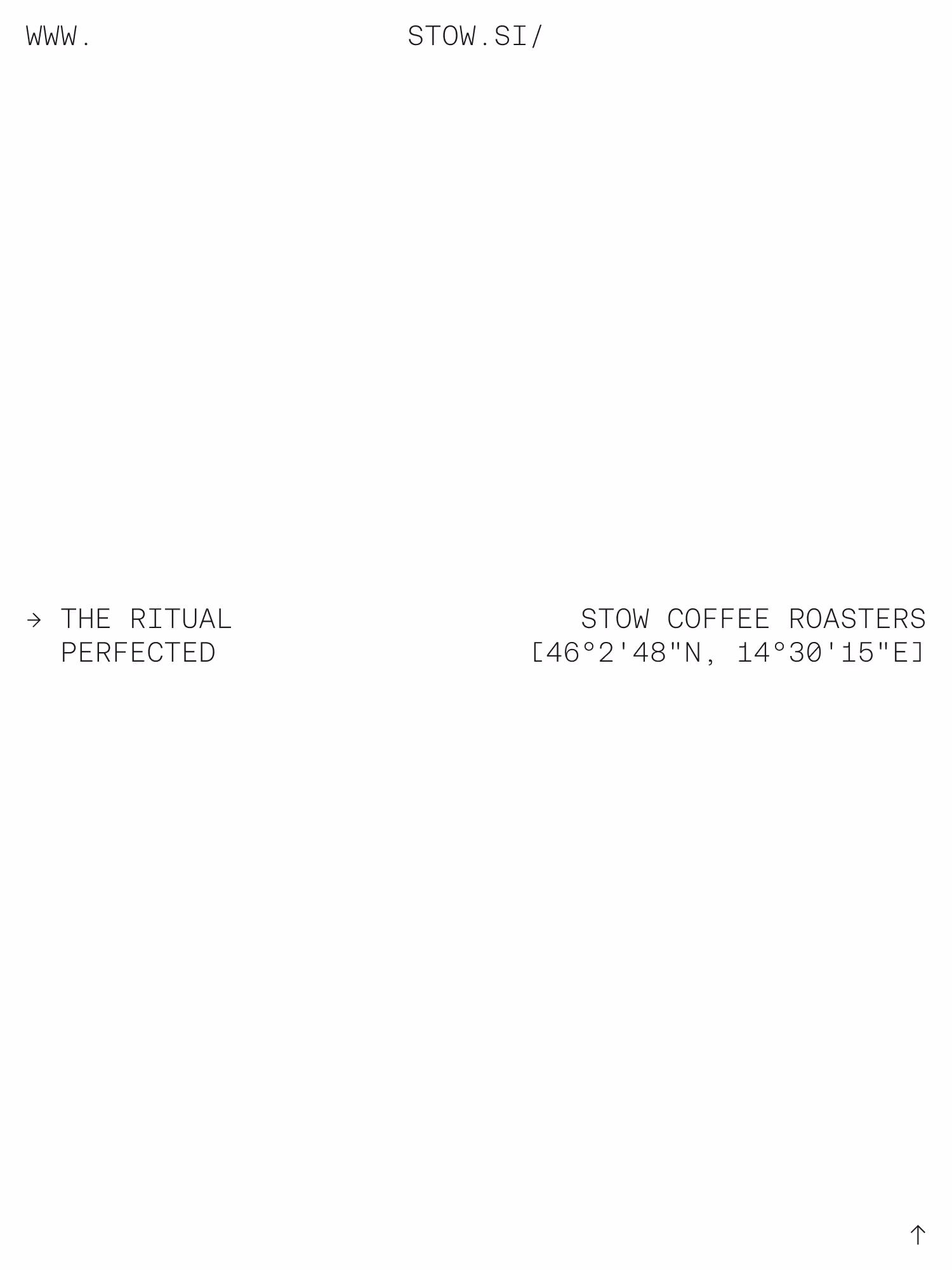
Switch between dark mode and light mode

STOW

Branding
Web Design
Person holding a black resealable bag with the word STOW printed on it in large letters.Person holding a black resealable bag with the word STOW printed on it in large letters.
About the project

Restoring Coffee to Its True Identity

STOW is a specialty coffee café, roastery, and distributor. They source some of the finest single-origin coffees in the world and roast them with precision, aiming to reveal the full character of each individual batch. From everyday specialty coffees to rare, hard-to-access gems, STOW’s mission is to restore coffee’s true identity, placing taste, origin, and craft at the center of the experience.

Logo of STOW Coffee featuring a stylized factory with a tall chimney and a coffee bean symbol above the entrance.
The Challenge

Making Process, Precision, and Confidence Visible

Existing STOW identity felt generic and lacked distinction, but it also offered a rare opportunity: a clean slate. The core challenge was to translate who STOW truly are. Not only as a brand, but as a café, a roastery, and a team. Their work is driven by a scientific mindset and a deep, almost obsessive relationship with coffee. Every cup is the result of experimentation, precision, and an ongoing pursuit of perfection. The new identity needed to express that mindset clearly and confidently, while remaining functional across a wide range of applications.

Metal robotic arm holding a transparent cylindrical container filled with coffee beans.
Graph with three temperature curves over time from 1 to 20 minutes, labeled with roast plan details, including turning point, yellow, cinnamon/crack, and end events.
Text-based layout detailing general information about Finca El Morito coffee estate in Guatemala, highlighting grower Jose Roberto Monterosso, altitude range 1400-2000 meters, and estate description with a large faded 'STOW' text in the background.
Text list of Stow Coffee Roasters with location Ljubljana, Slovenia, coordinates, website, and a selection menu highlighting Yirgacheffe coffee for today.
Dot histogram chart showing coffee quality in days, with best quality highlighted in red between 25 and 75 days.
The Approach

Where Science Meets Sensory Experience

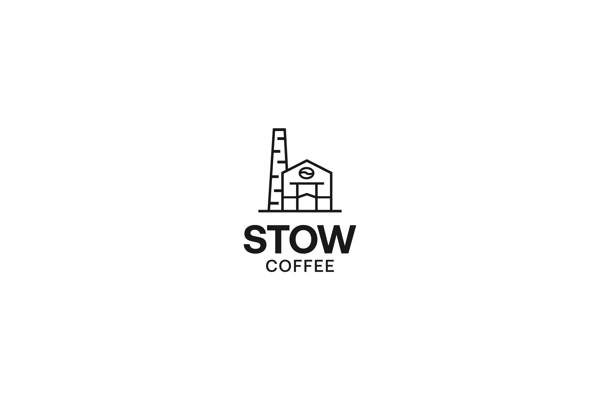
One thing was clear from the beginning: we didn’t want to lose the iconic STOW logo. It was the only existing element with real meaning and visual distinctiveness, and it already set them apart from competitors. Instead of replacing it, we chose to build the entire system around it.

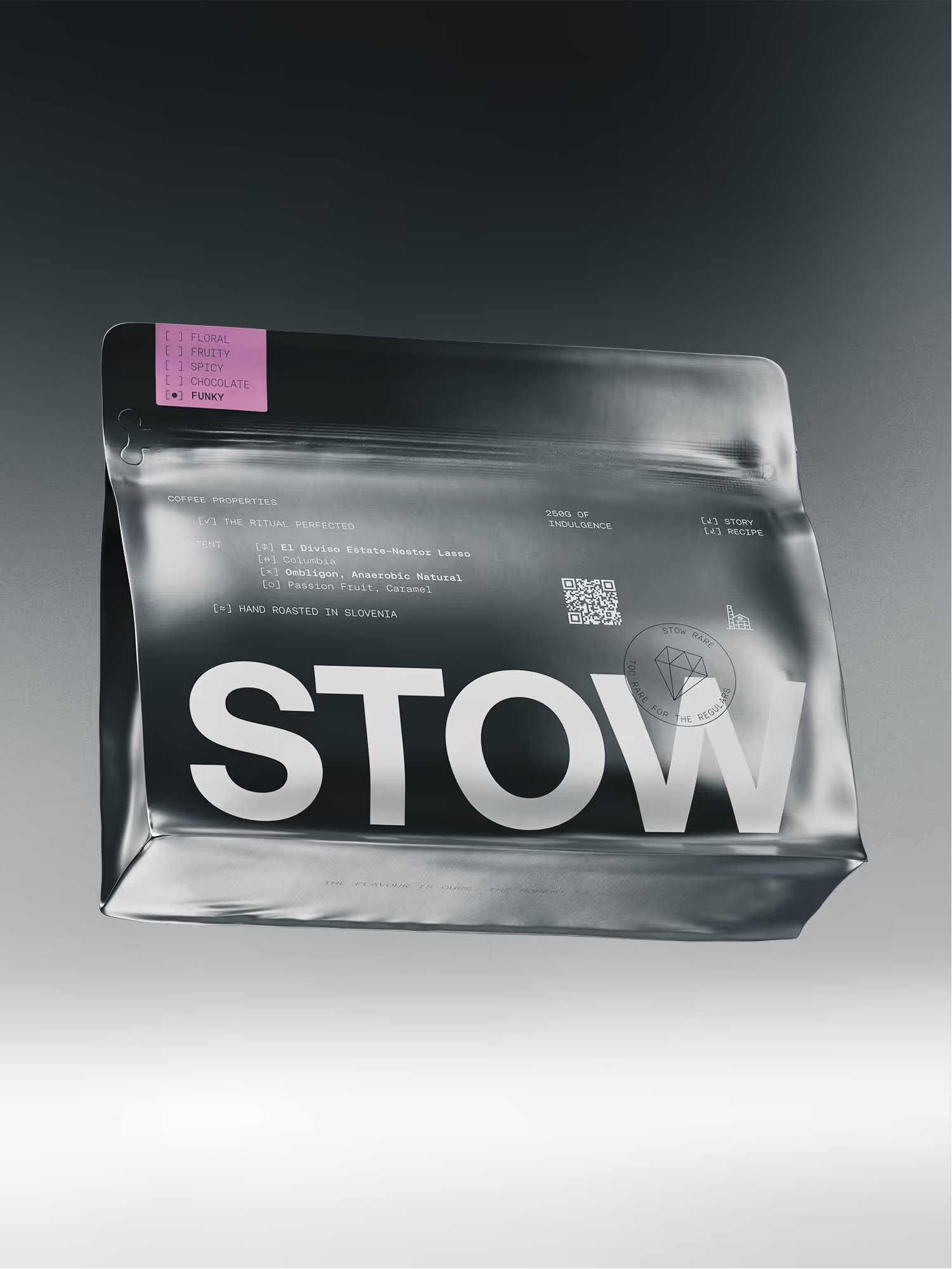
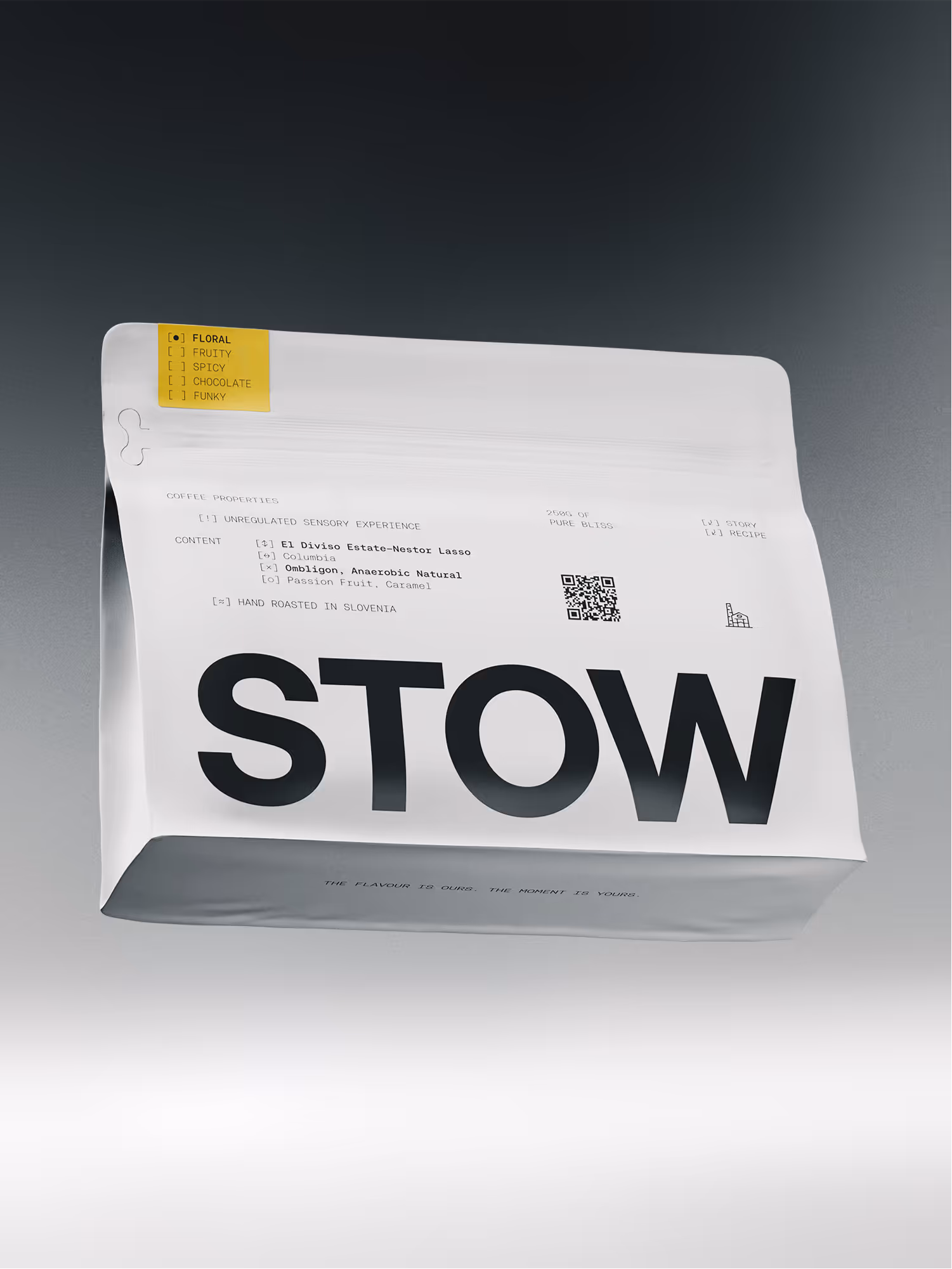
STOW approaches coffee with scientific rigor. Roasting, sourcing, and brewing are treated as processes governed by data, testing, and documentation. Our goal was to bring those hidden layer to the surface. To visually express precision, attention to detail, and the technical complexity behind each cup. At the same time, coffee is an inherently sensory product, defined by aroma and flavour. Since flavour is most intuitively communicated through colour, we knew that colour would need to play a central role in the system, carefully balanced with a restrained, utilitarian foundation.

Radar chart showing coffee properties with high sweetness, acidy, and aftertaste, moderate balance and body, and low bitterness.
Minimalist typographic layout with text showing 'www.stow.si/', 'The ritual perfected', and 'STOW Coffee Roasters' with geographical coordinates.
Black coffee bag labeled STOW with flavor options checked for funky, placed on a metal surface.
Metallic coffee bag labeled STOW with a pink flavor tag marking 'FUNKY' and details about coffee origin and roast.
White coffee bag with large black text 'STOW' and coffee properties including floral flavor, hand roasted in Slovenia, and a QR code.
The Solution

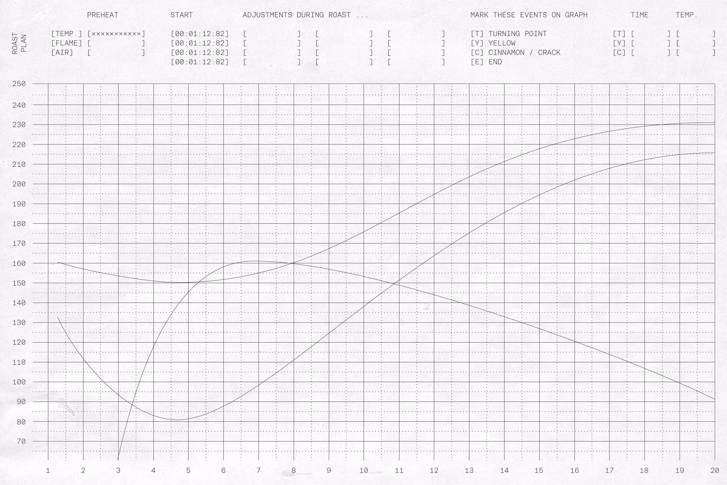
A Distinct System Built for Clarity and Scale

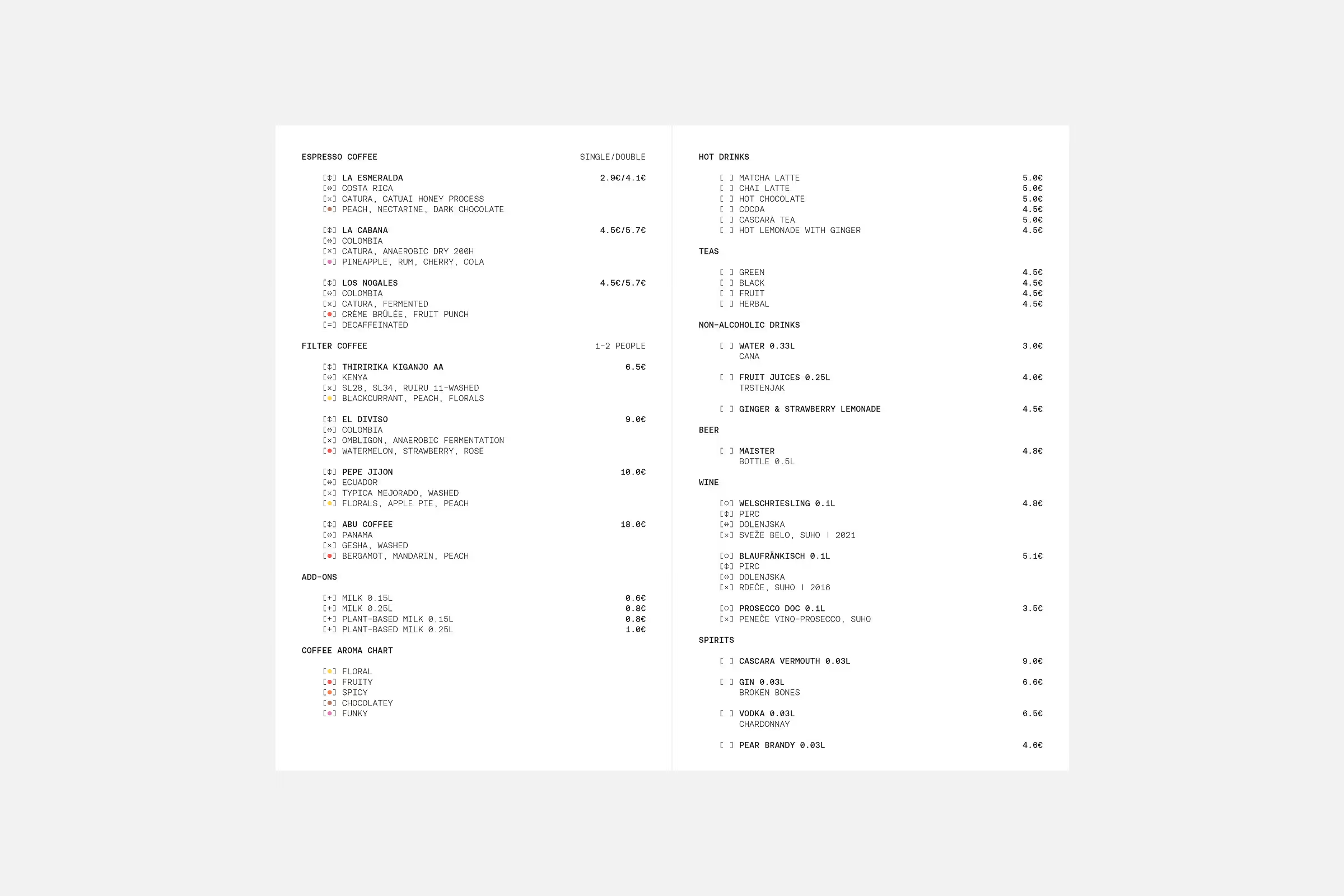
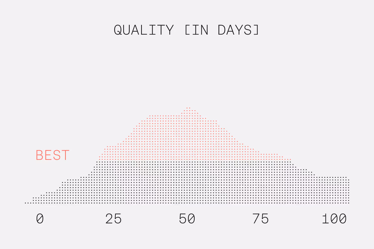
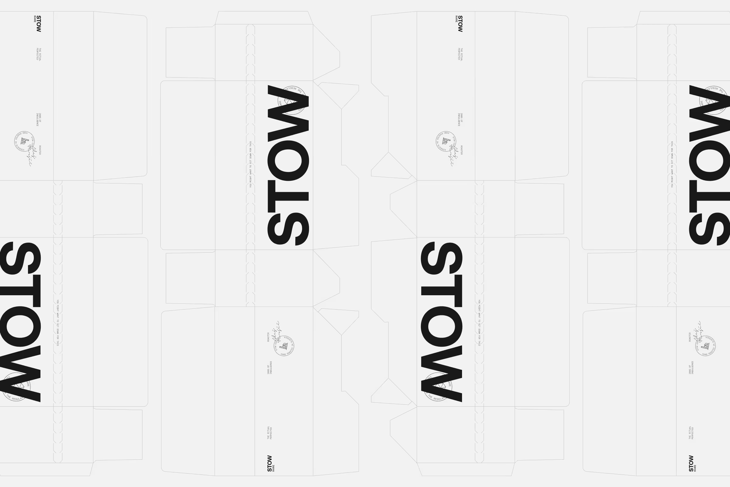
The identity is built around a highly functional typographic system that defines the overall aesthetic. A monospaced typeface, basic symbols, and structured layouts draw inspiration from coffee roasting documentation, such as parameters, graphs, and extraction data, shaping a clear and process-driven visual language.

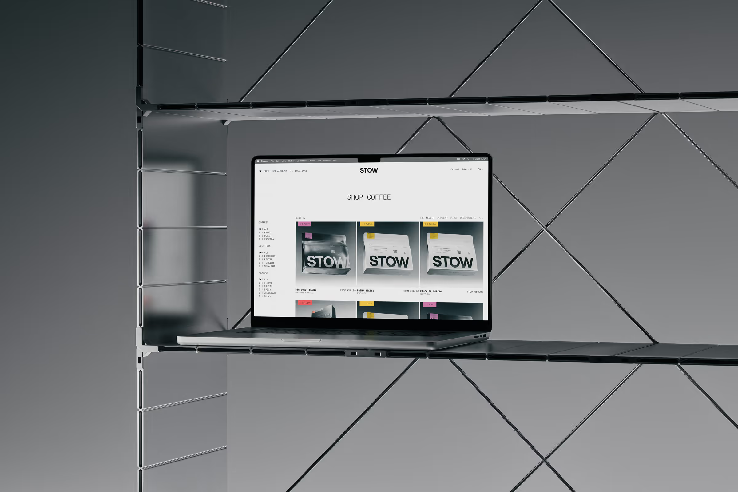
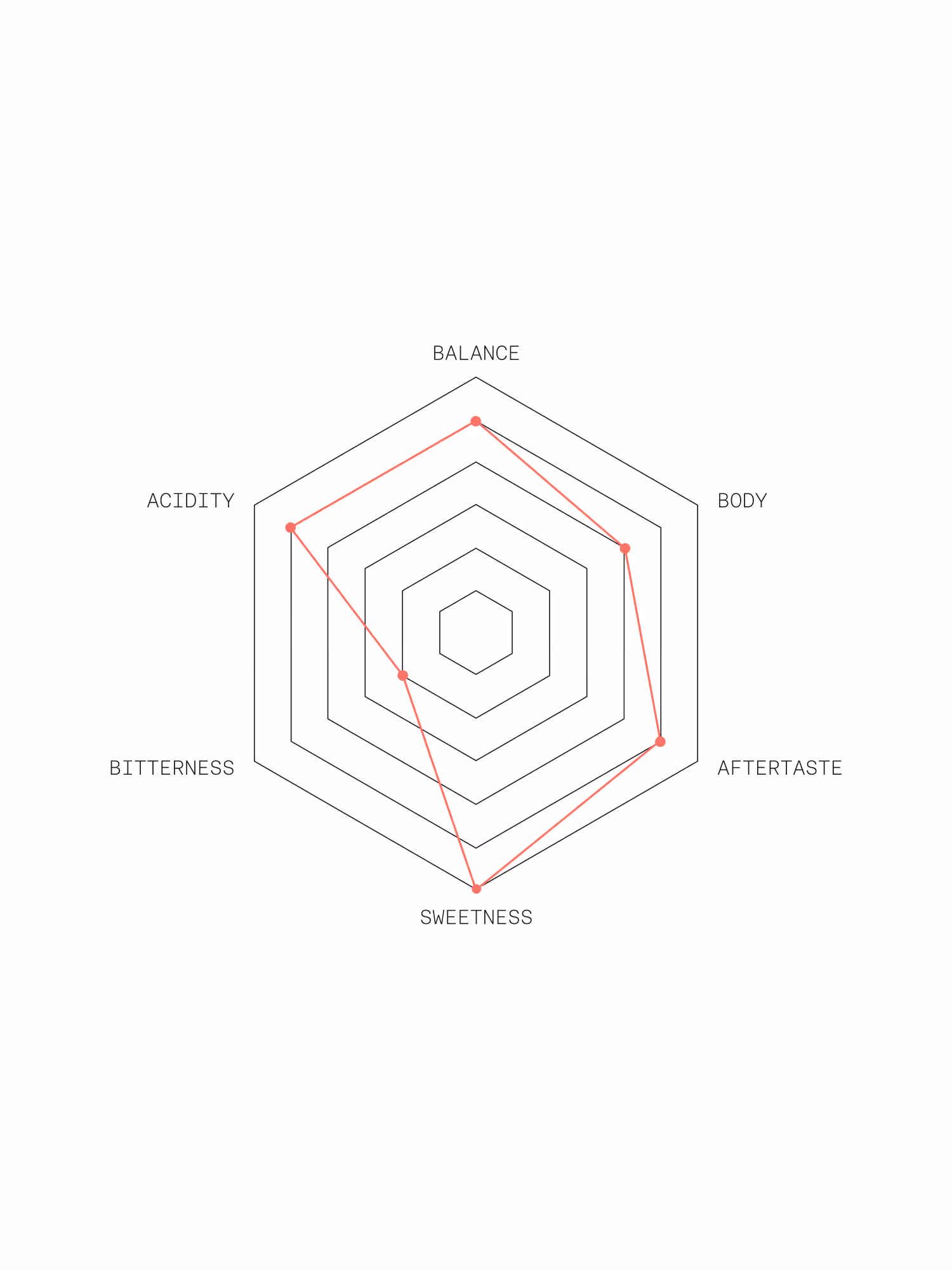
While the foundation remains minimal and monochrome, flavour becomes the expressive layer. A colour coding system categorises coffees by flavour profile, helping set expectations before the first sip and working intuitively across packaging, menus, and retail environments.

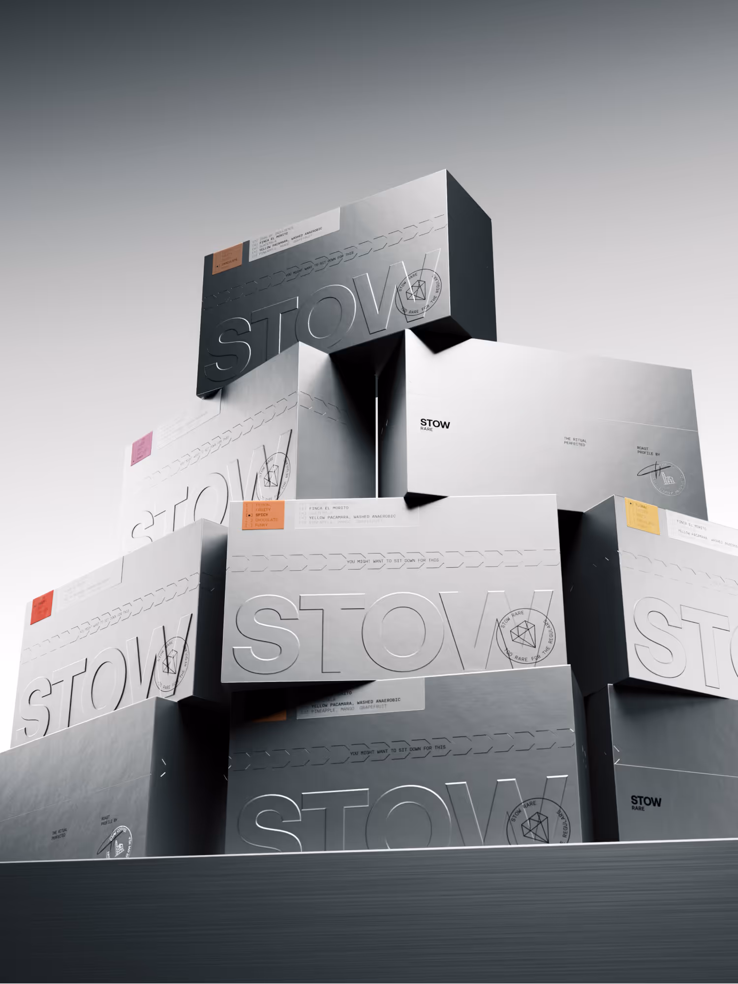
The system expands further for STOW Rare, a limited selection of exceptional coffees. Here, metallic packaging and a refined unboxing experience reference laboratory materials and signal precision, scarcity, and craftsmanship. Together, these elements reflect STOW’s philosophy: disciplined, scientific, and deeply connected to the sensory world of coffee.

Flat layout template of white STOW branded packaging boxes with black text and subtle gray line crease marks.
Metallic surface with embossed text 'STOW' and labels indicating coffee details including '250G of Indulgence', 'Finca El Morito', 'Guatemala', 'Yellow Pacamara, Washed Anaerobic', and flavor notes 'Pineapple, Mango, Grapefruit'.
Embossed circular logo with stylized factory and text reading 'STOW COFFEE HAND ROASTED IN SLOVENIA' on a textured surface.
Stack of sleek metallic boxes with embossed 'STOW' branding and colorful flavor labels in a minimalist setting.
Cafe menu displaying espresso coffee, filter coffee, add-ons, coffee aroma chart, hot drinks, teas, non-alcoholic drinks, beer, wine, and spirits with prices.
Laptop on empty modern metal shelf showing an online shop page for STOW coffee products.
Stack of business cards for Tim Hafner, Stow Caffe Manager, placed in a transparent brown holder on a white surface with a metal tray and spoon partially visible.
Back view of person with long black hair wearing a white shirt with black text reading 'EXPERIMENT NO. 100G' and smaller text including 'FLAVOURS OF JOY, FOCUS, EUPHORIA', 'OUTCOME', and 'ALWAYS DELICIOUS'.

Similar projects

Central black circle with blue-purple gradient stylized phi symbol, connected by curved dotted and solid lines to labeled nodes: HyperLiquid, Jupiter, Kamino, Aave, and Drift on a blue to purple gradient background.
Branding
Web Design

Project Ø

Temporal Landing page on iphone device
Web Design
Creative Coding

Temporal Website

A Lunasol wrapping paper
Branding
Web Design

Lunasol

Up