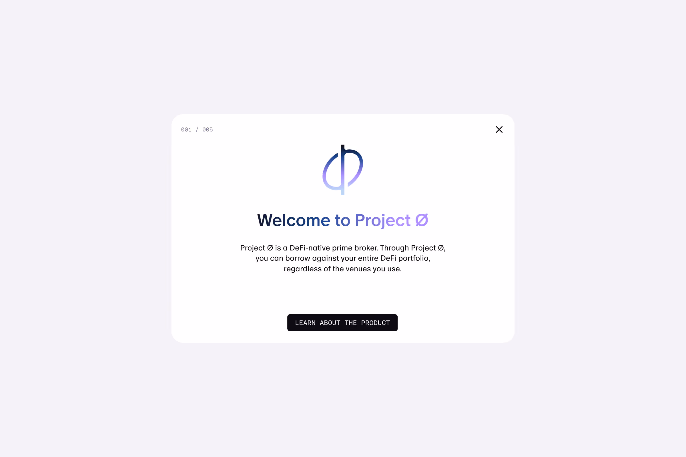
Project Ø App
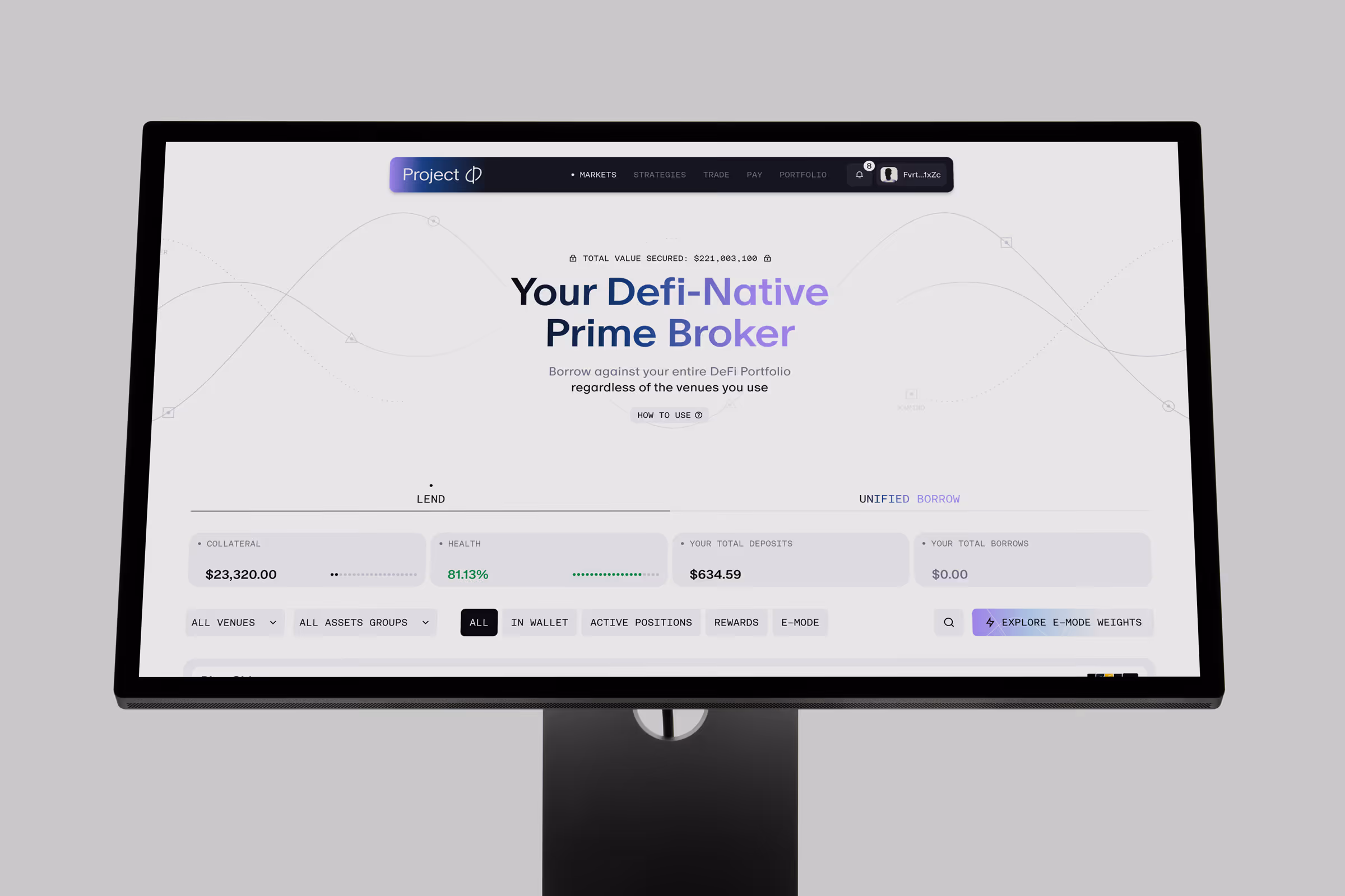
Project 0 rethinks how DeFi products work.
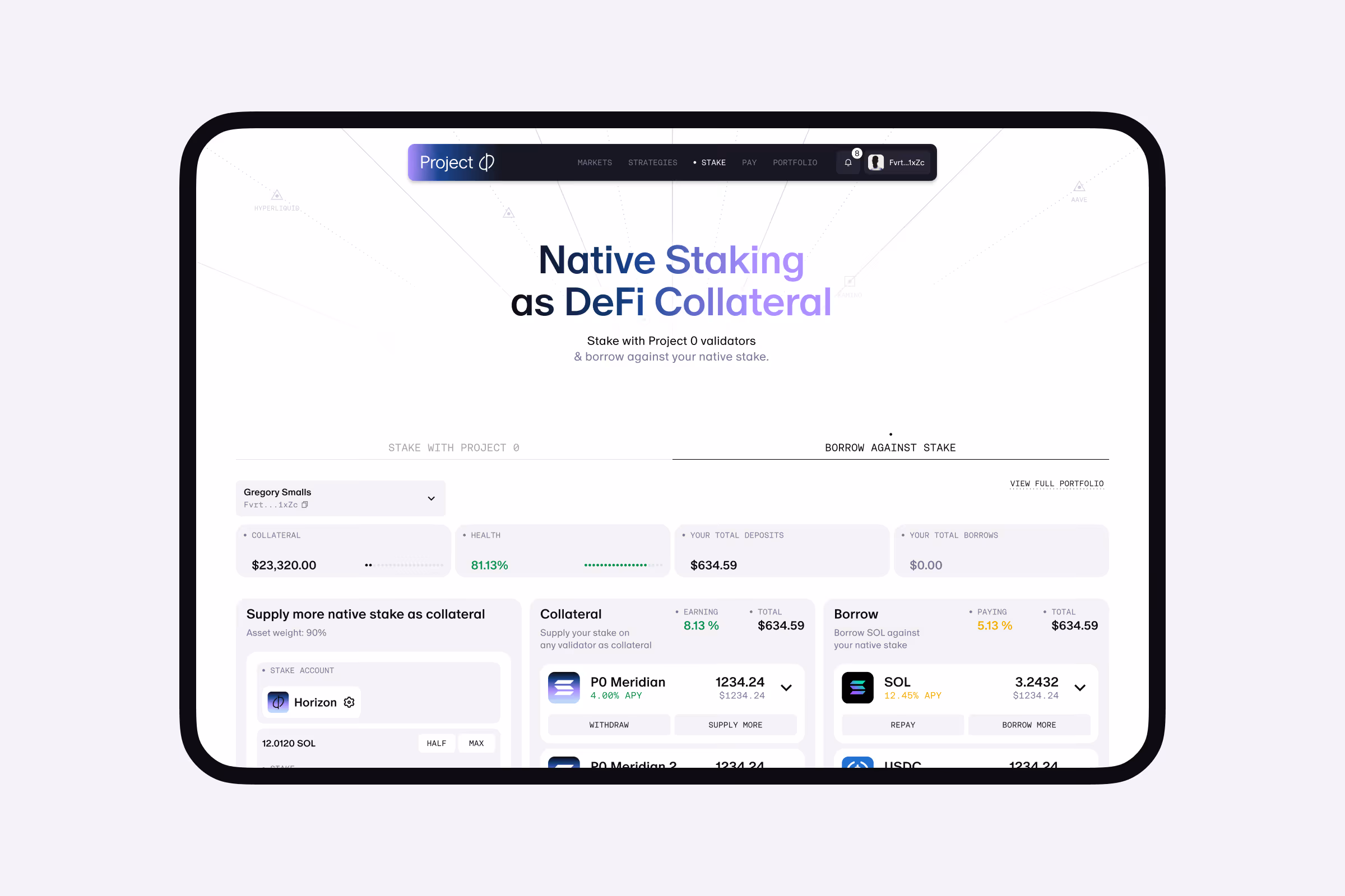
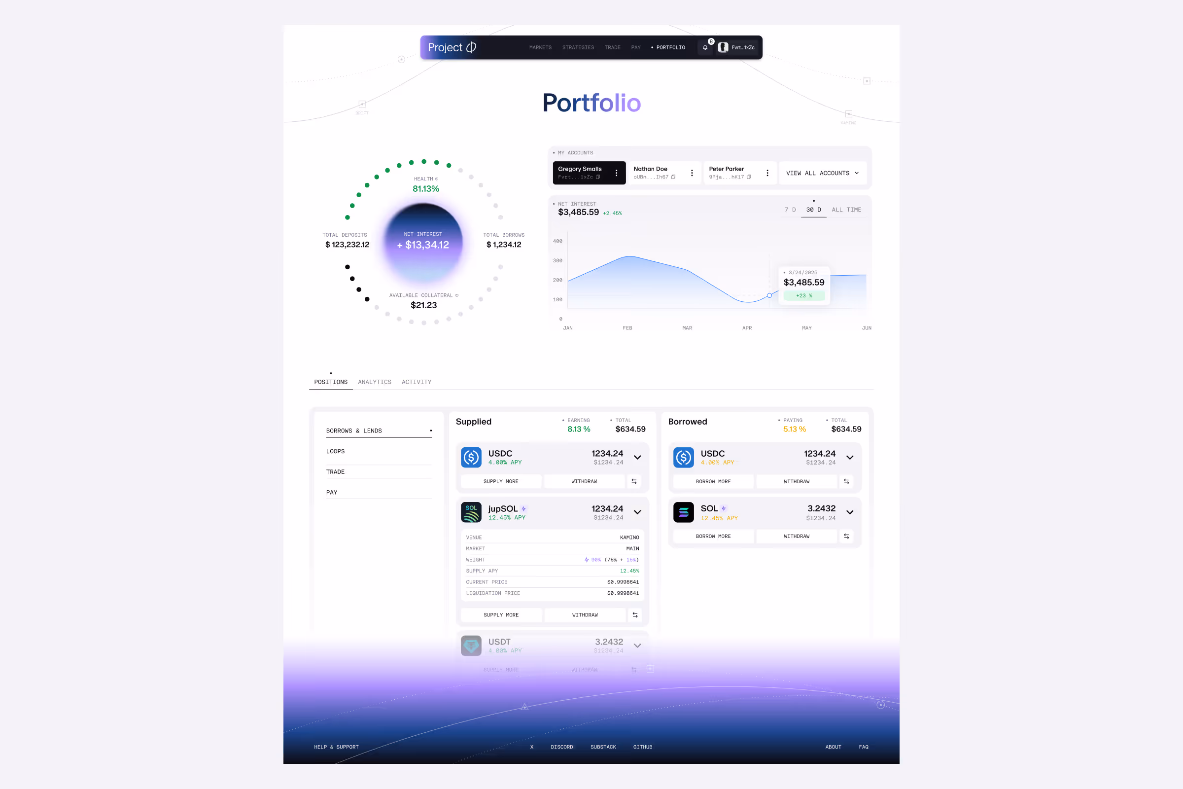
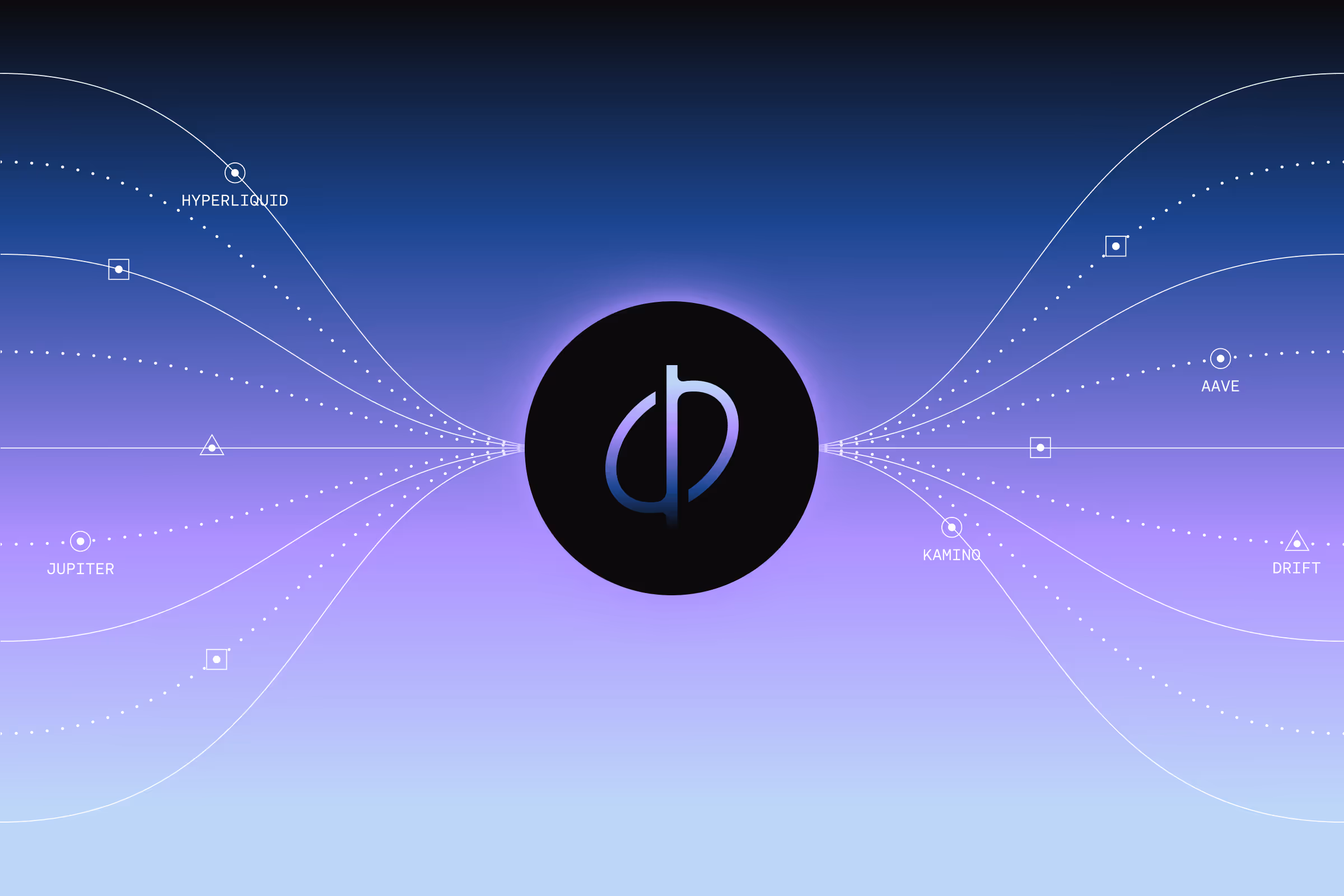
Instead of managing positions across multiple protocols, everything lives in one place and can be used as a single source of collateral. This unlocks a new level of capital efficiency that DeFi hasn’t really seen before.With a few existing patterns to follow, we designed the product and its system from the ground up, helping define a new standard for DeFi UX.
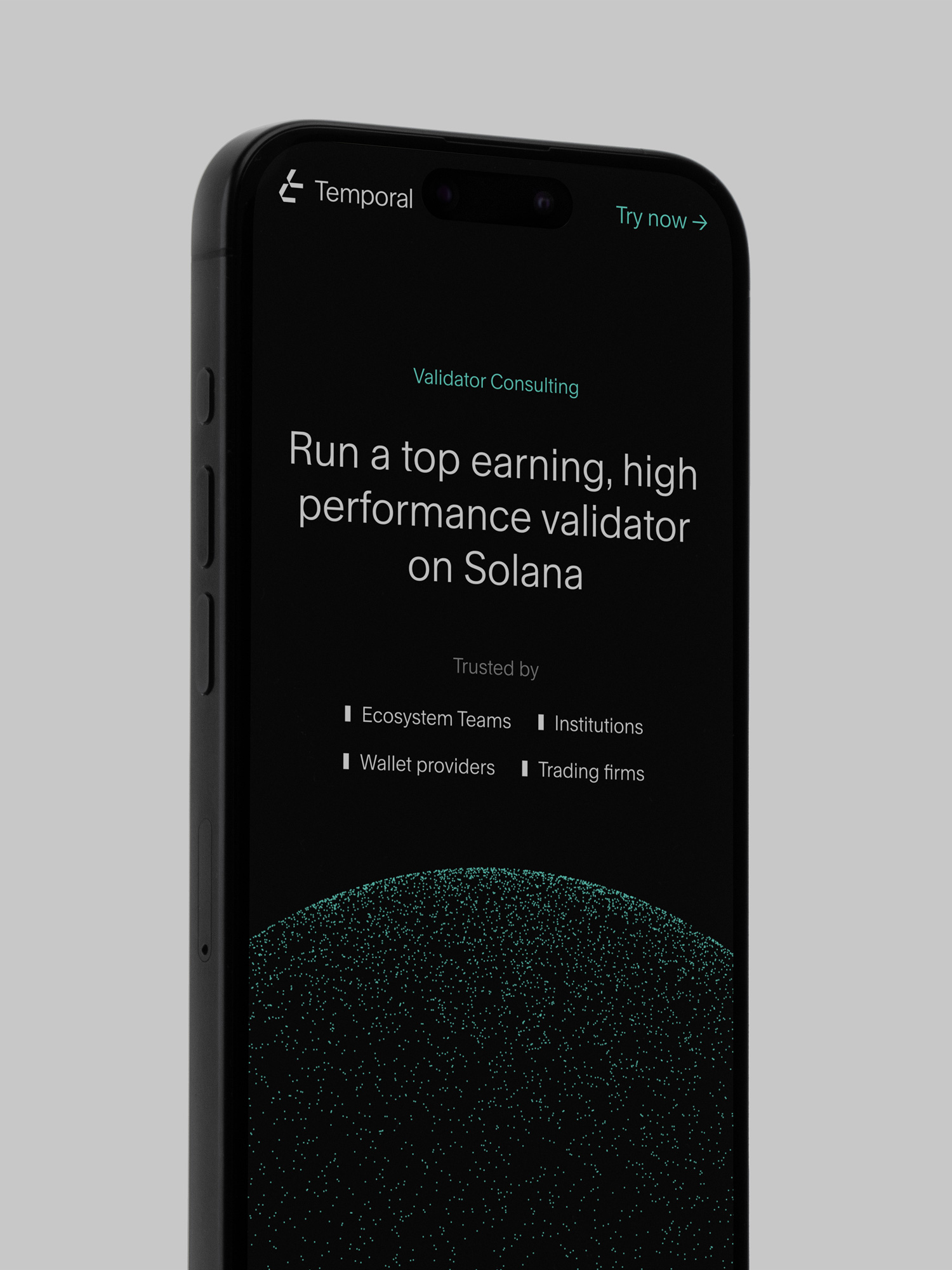
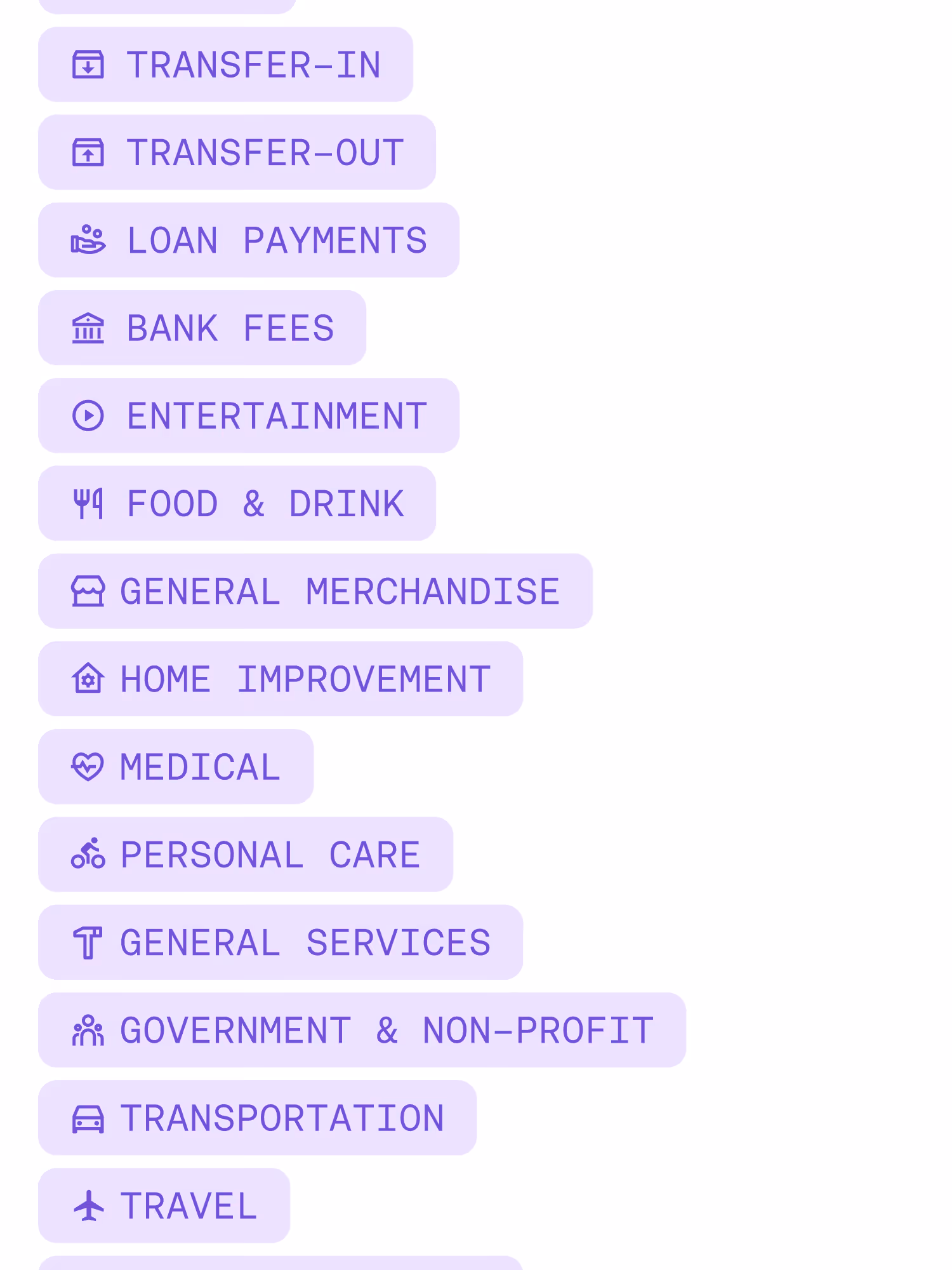
Hiding the Complexity
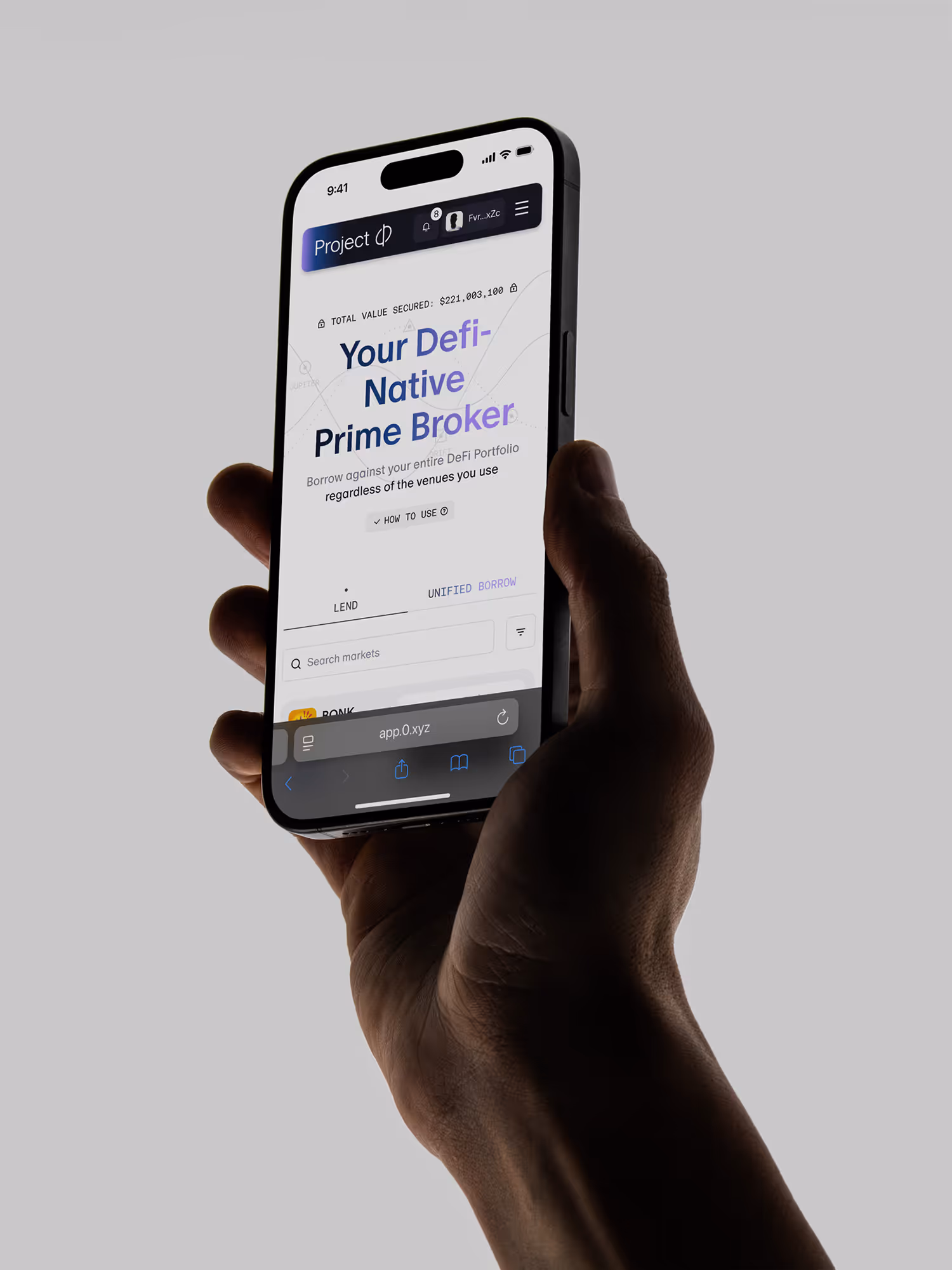
DeFi is powerful, but hard to navigate. Our goal was simple: make it feel clear and intuitive. In collaboration with the Project 0 team, we striped complexity down to its essentials. Every interaction was considered to reduce friction.The result is a adaptable system that keeps every action focused and efficient.
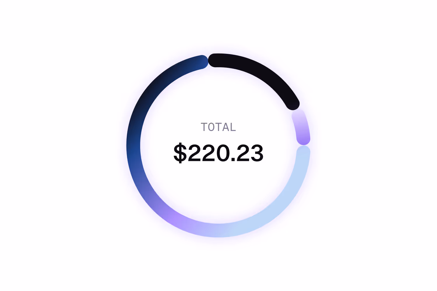
Function meets aesthetics
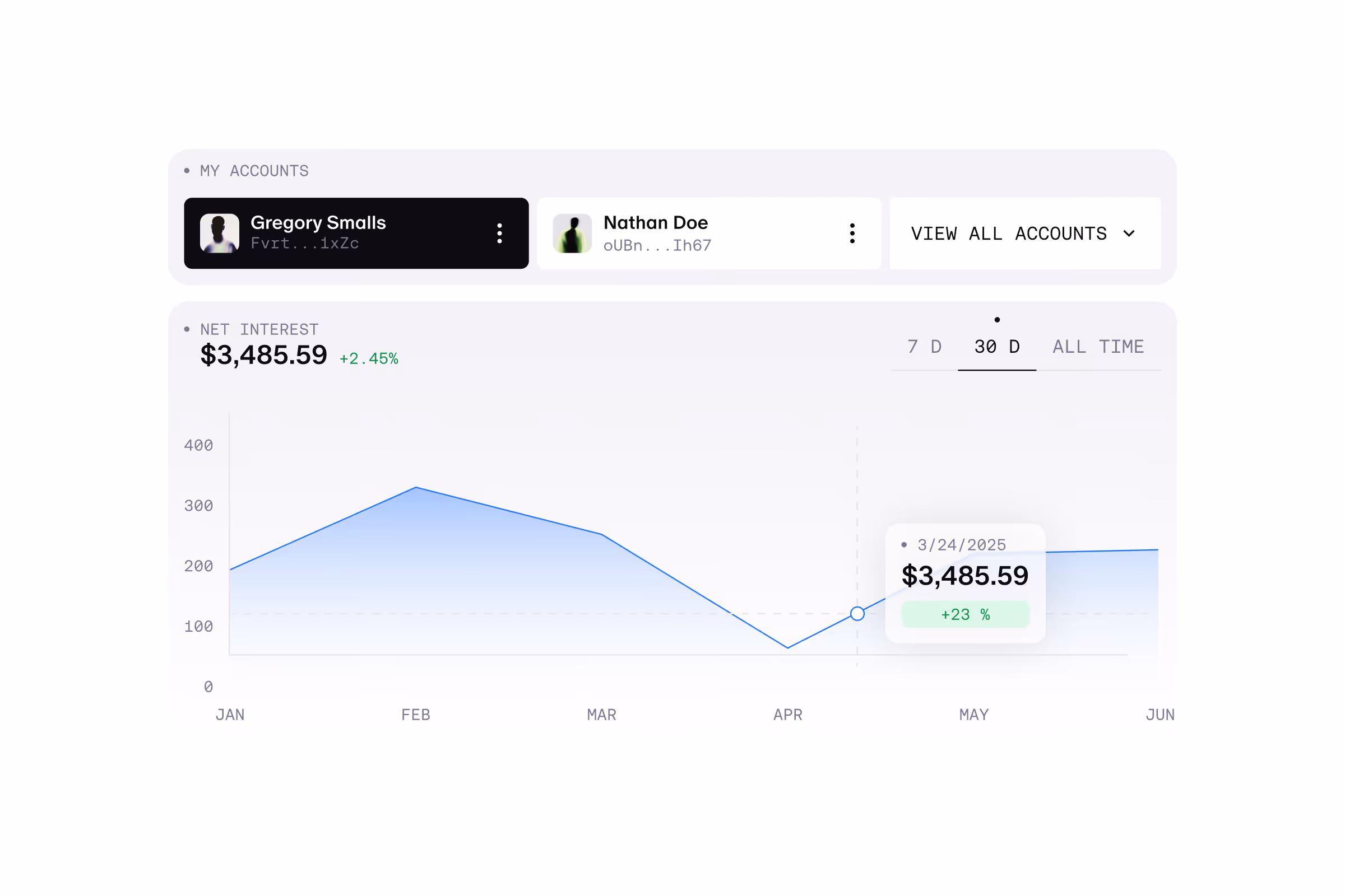
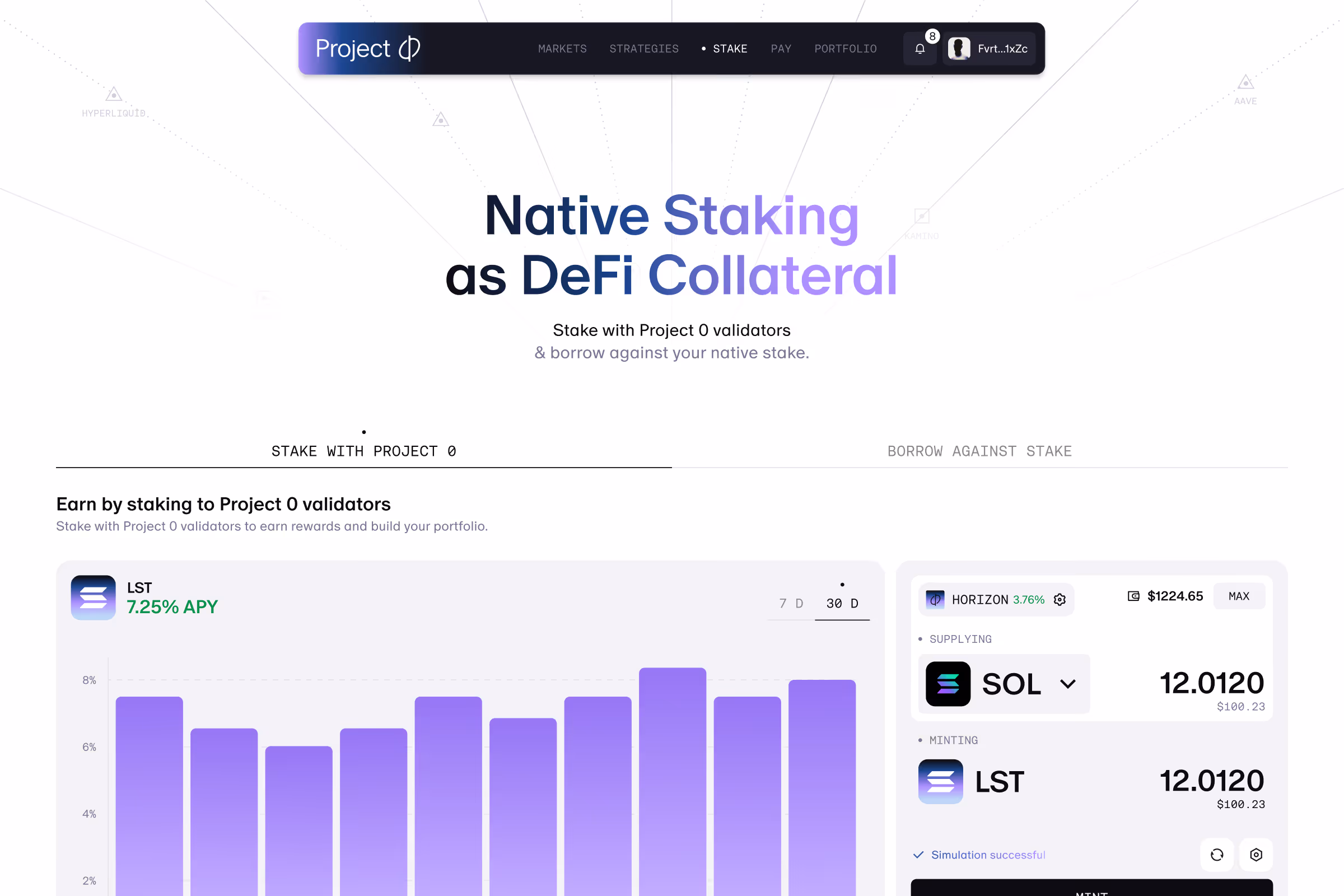
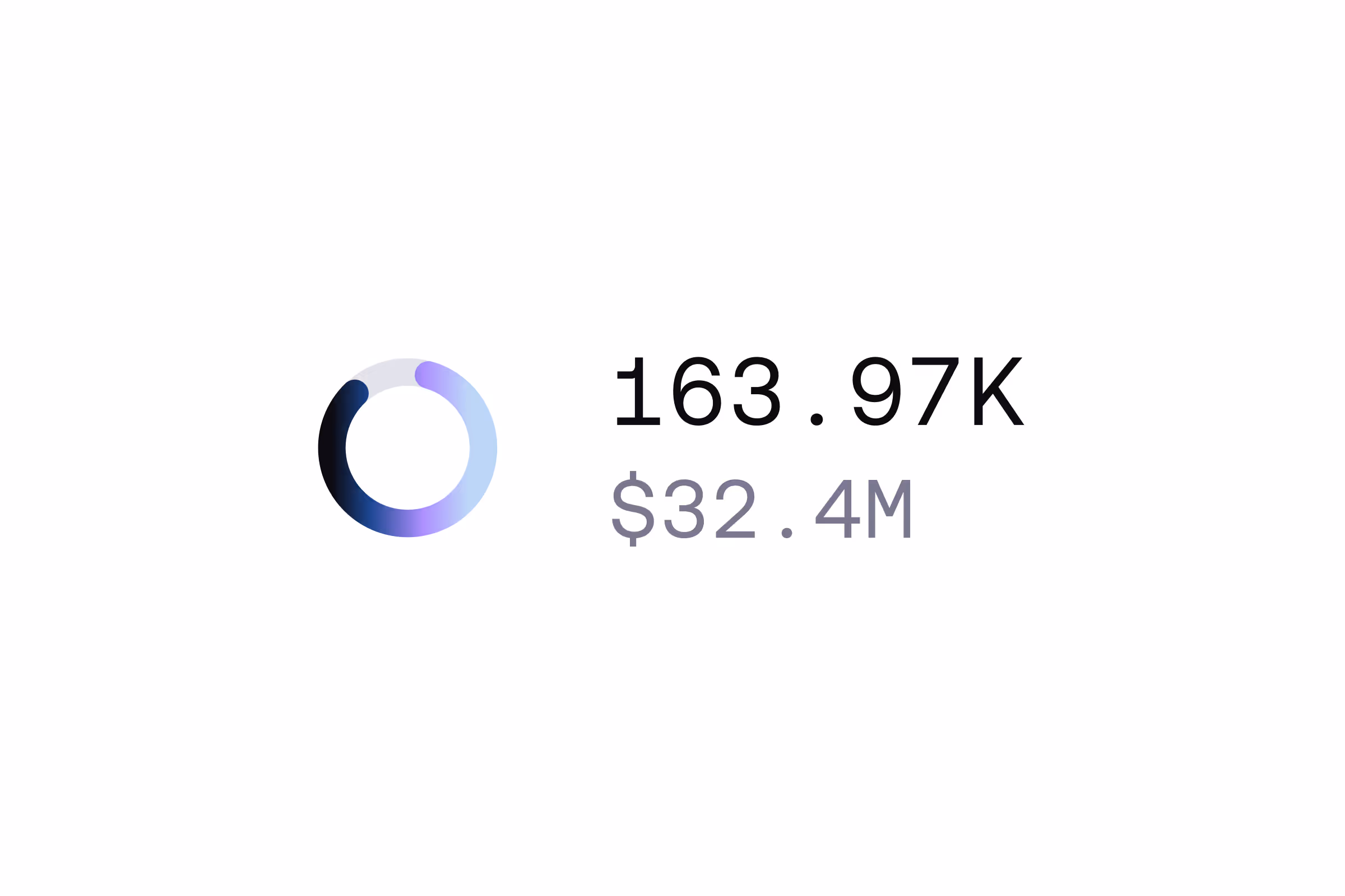
This isn’t just a tool, it’s a product people will spend time in.Clarity comes first, but the visual layer matters. We brought the brand in the centre of the interface.A persistent mini portfolio gives users a real-time overview of their positions, while a dynamic action box becomes the core interaction point across lending, borrowing, and staking.Gradients, motion, and micro-interactions aren’t decoration but add feedback, depth and a sense of control.
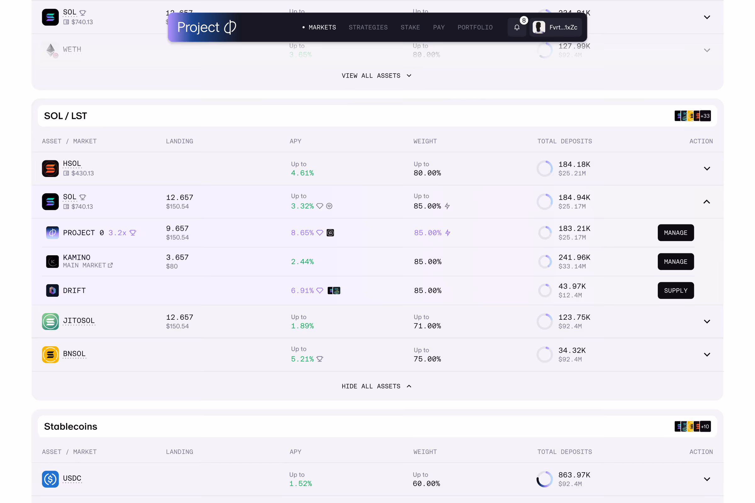
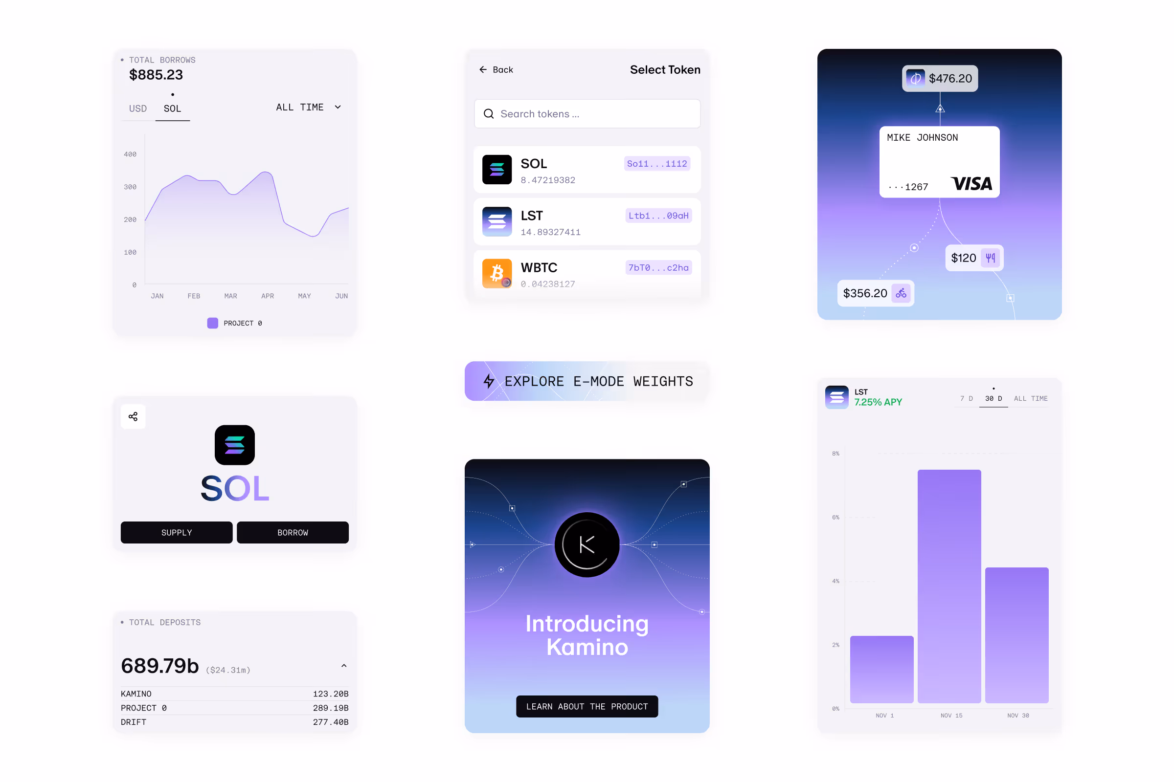
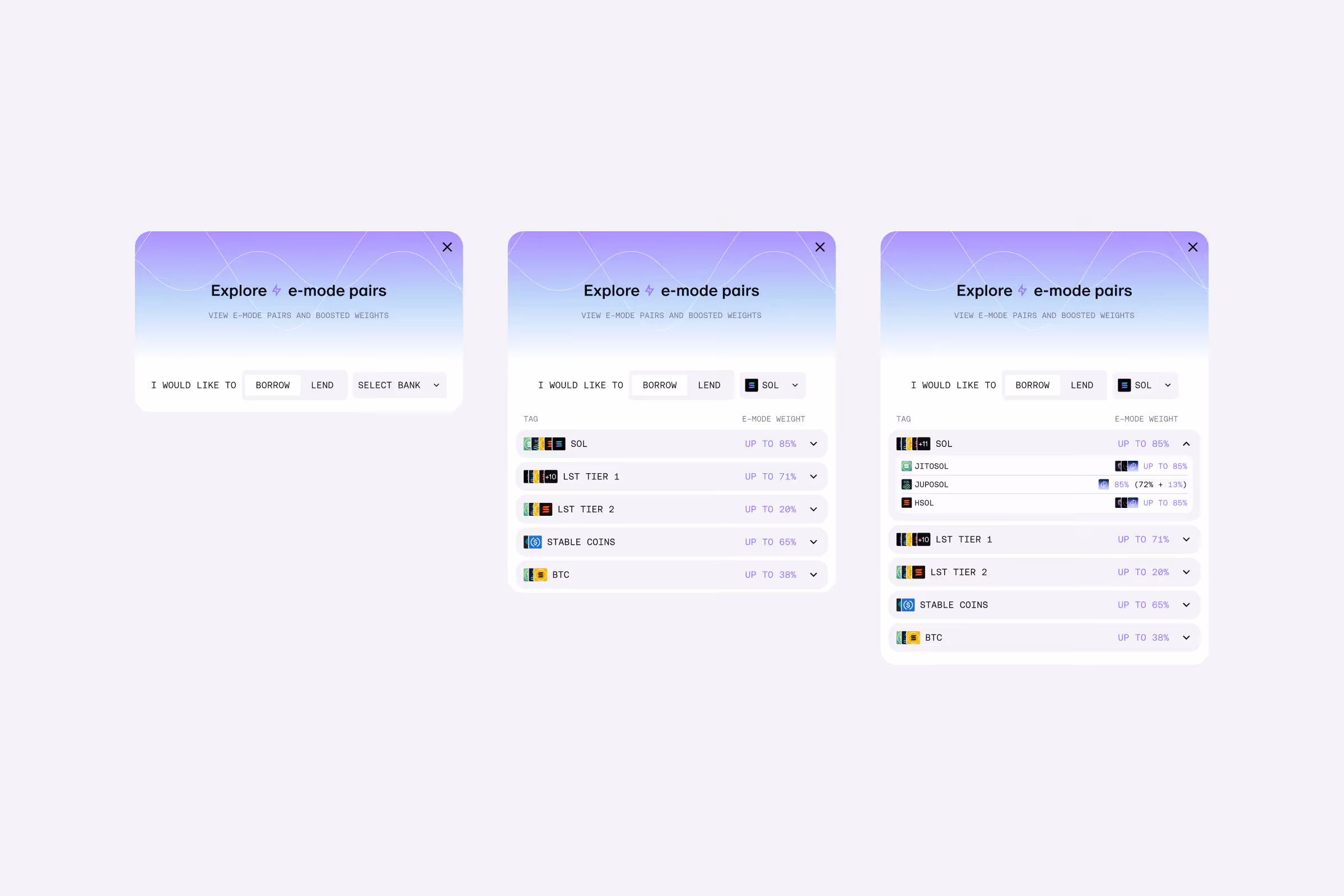
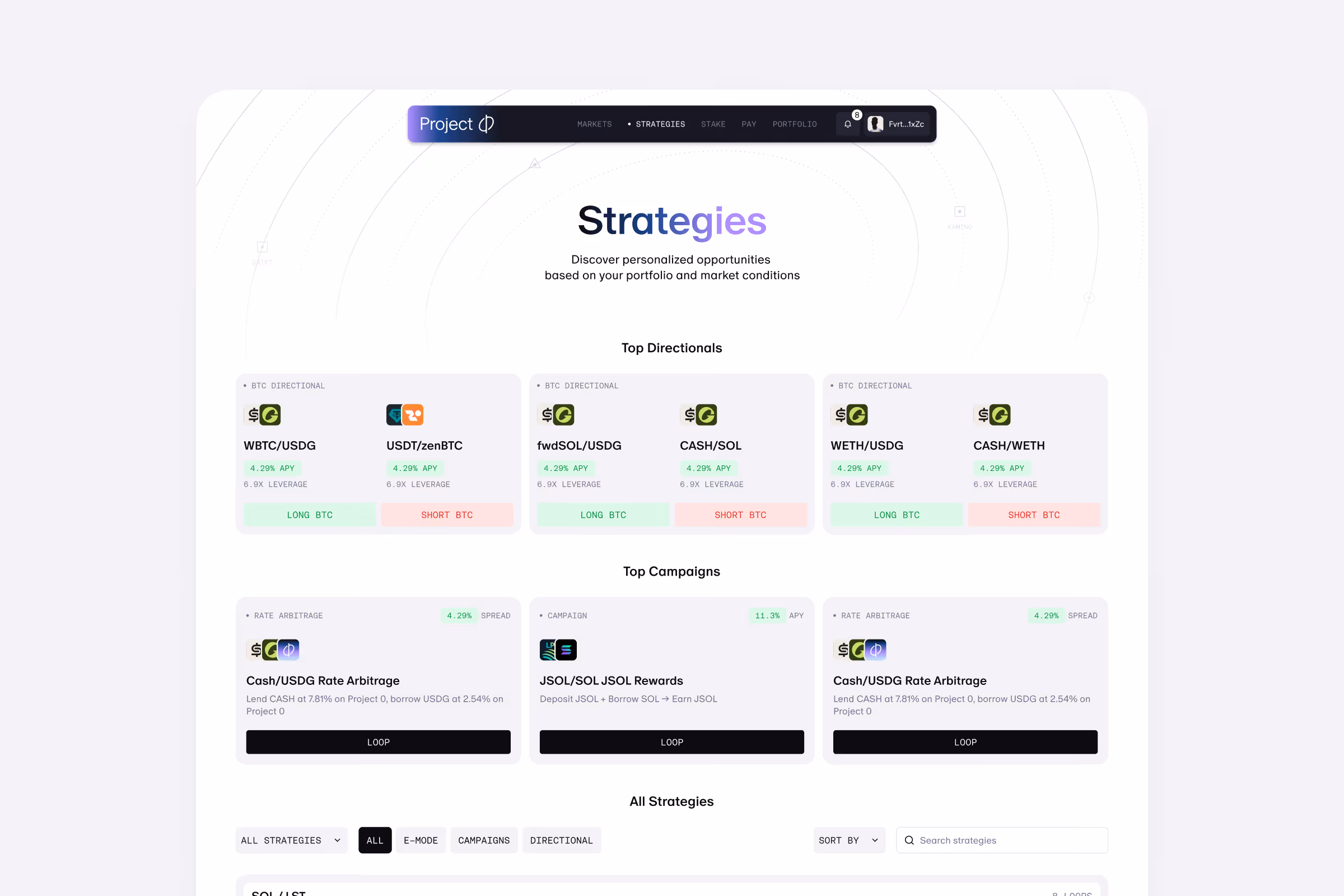
Scaling Functionality
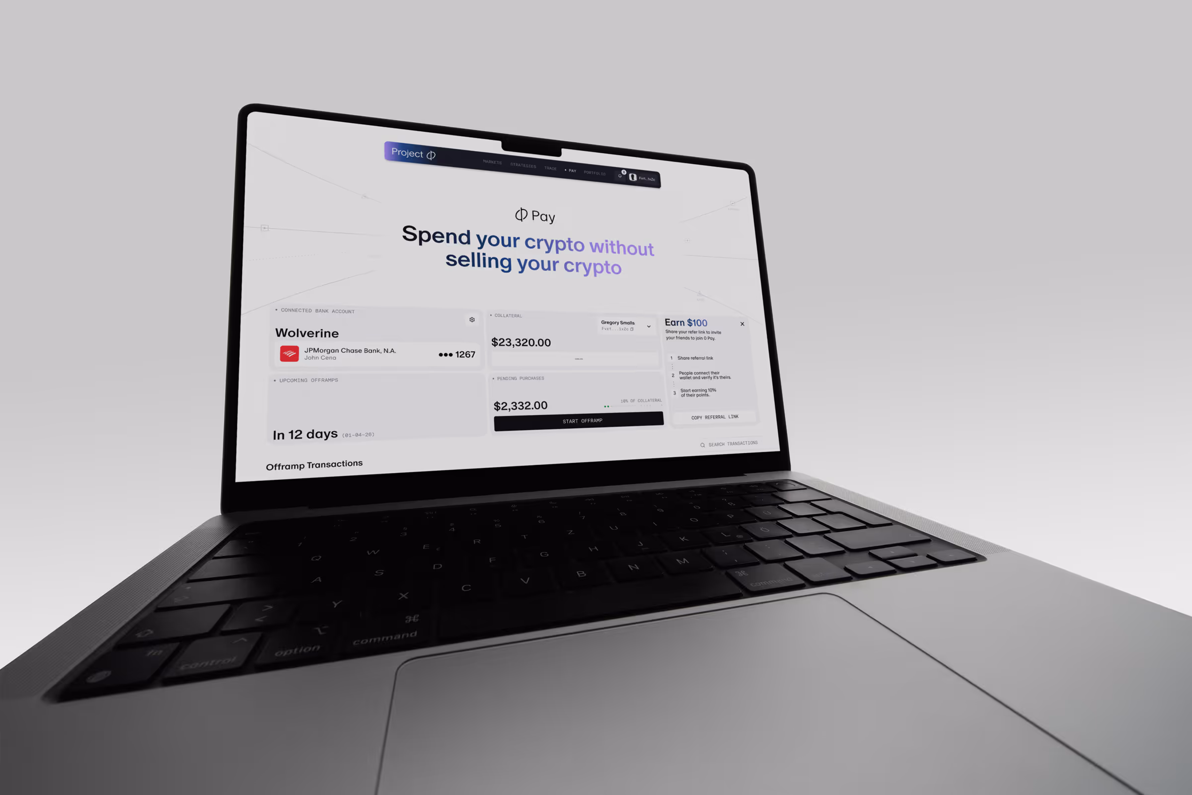
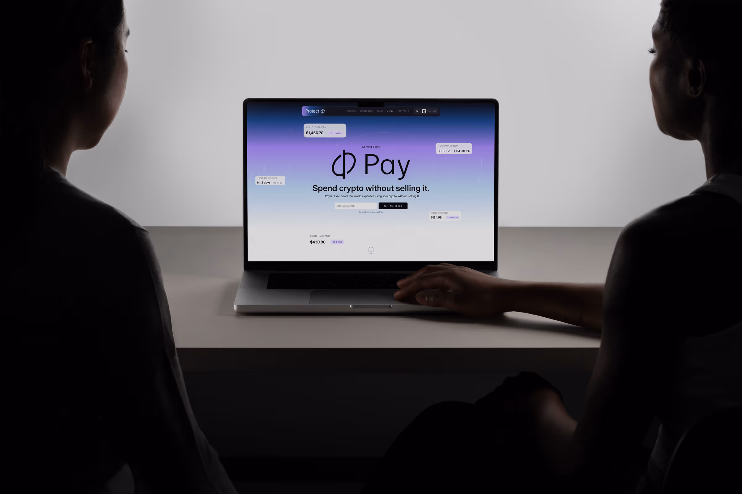
The platform brings together a wide range of advanced features.Unified borrowing sits at the core, allowing users to leverage their full portfolio. Additional features include staking, portfolio tracking, strategy suggestions, real-time alerts, and 0Pay.All of it lives inside a system that stays easy to use even as functionality scales.
Designed to Feel Alive
We treated motion as part of the product, not an afterthought. Animations, responsive elements, and interactive gradients create a sense of flow. They guide attention, signal change, and reinforce every interaction. From small details to full transitions, the interface feels responsive, precise, and alive.
.avif)