Tunel Studio
Engineering speed, precision, and performance online.
Tunel designs, builds, and optimizes high-performance Webflow websites
for tech companies that demand more than a polished interface. Their work combines custom design and development with SEO, performance tuning, and conversion strategy, thus turning websites into fast, scalable growth engines. Whether starting from scratch or upgrading an existing platform, Tunel delivers with speed, precision, and technical excellence.
Defining the X Factor That Drives the Brand.
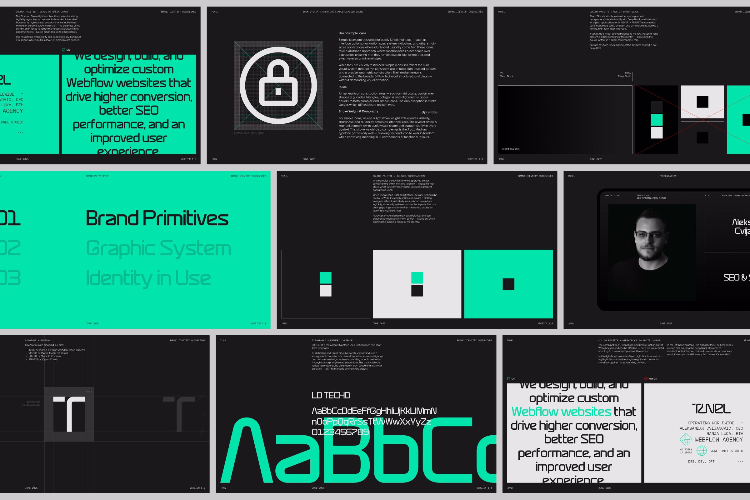
The challenge was to create a concept that felt both technically sophisticated and visually distinctive, capturing the X factor and core values of the brand (hi-end, efficient, serious, limitless, and trustworthy) while extending seamlessly across all materials. The identity needed to maintain a high-precision, dark-mode aesthetic that resonates with the tech world and reflects Tunel’s focus on performance and detail.
Where Meaning Meets Mechanics.
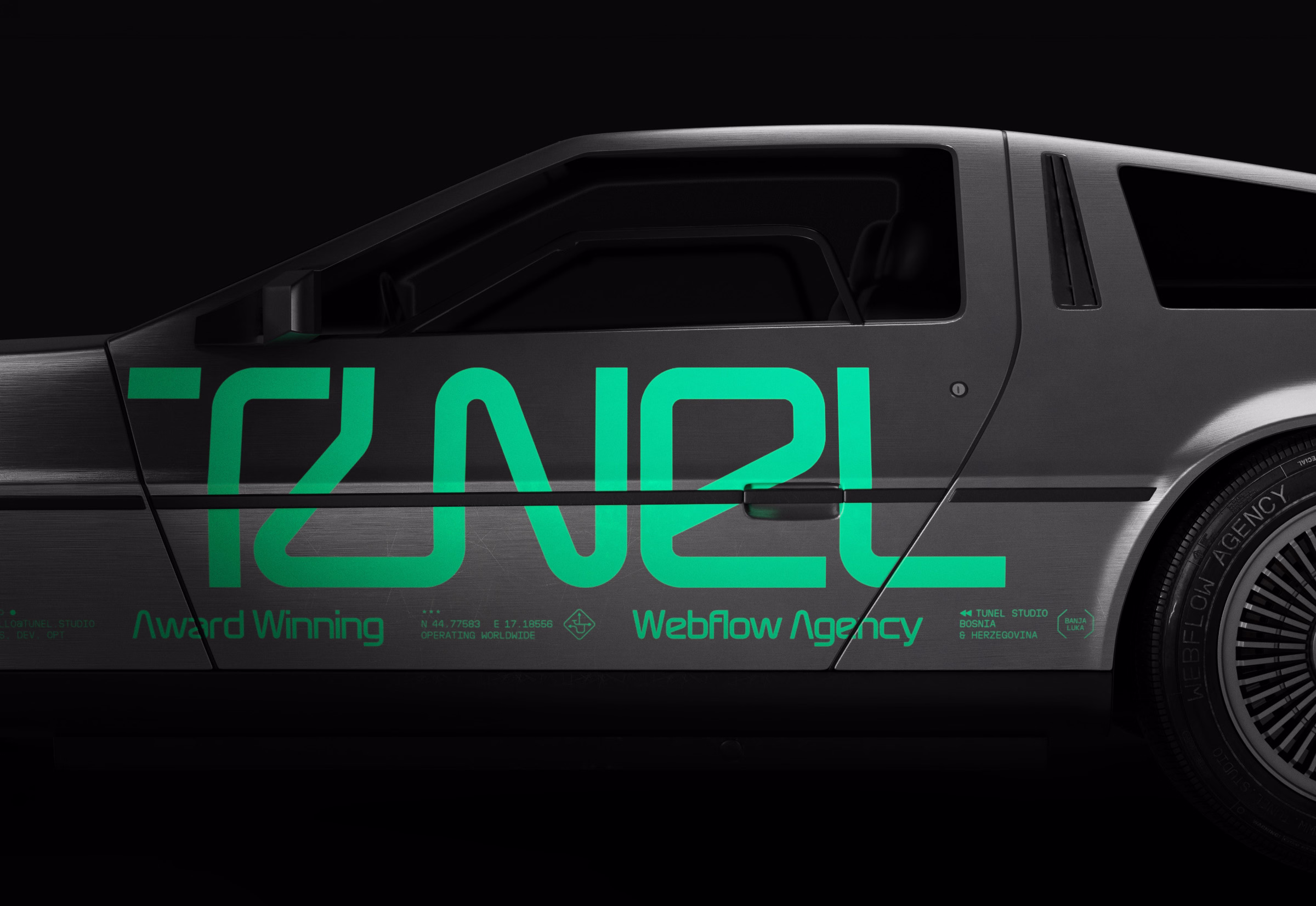
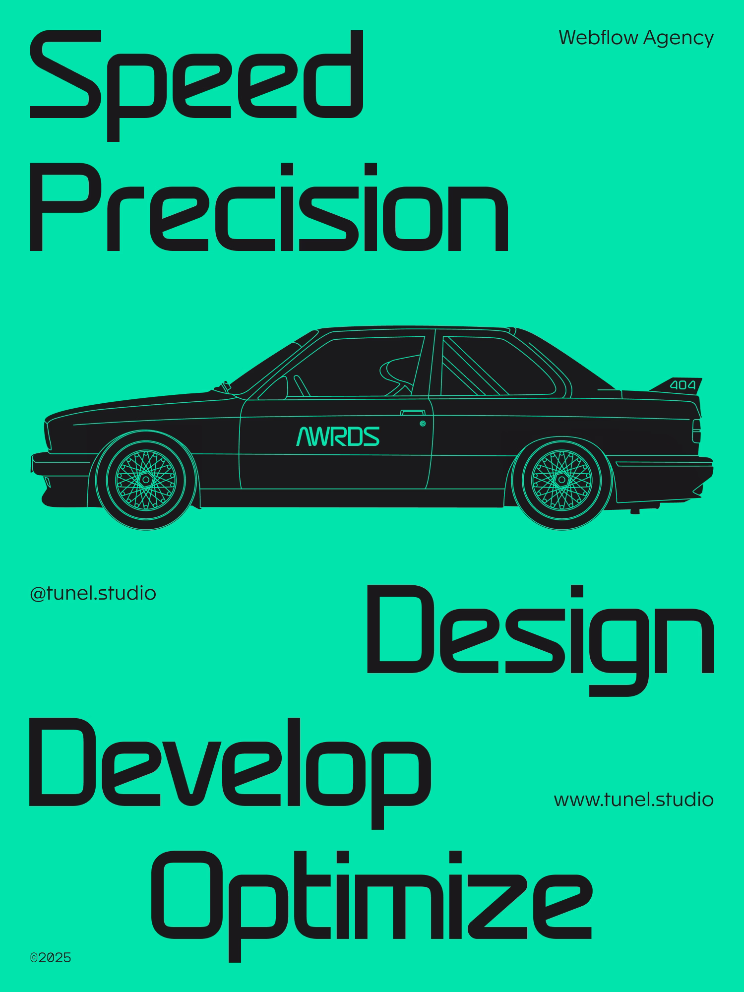
The inspiration for the identity came directly from the brand’s name. Tunel, meaning “tunnel” in Bosnian, naturally embodies the brand’s key attributes: speed, optimization, and transformation. Just like a tunnel serves as a shortcut through obstacles, Tunel accelerates growth and enhances online performance. This concept connected beautifully with the visual world
of racing, reflecting precision, power, and flow, while the tunnel itself became a metaphor for digital progress and clarity on the road ahead.
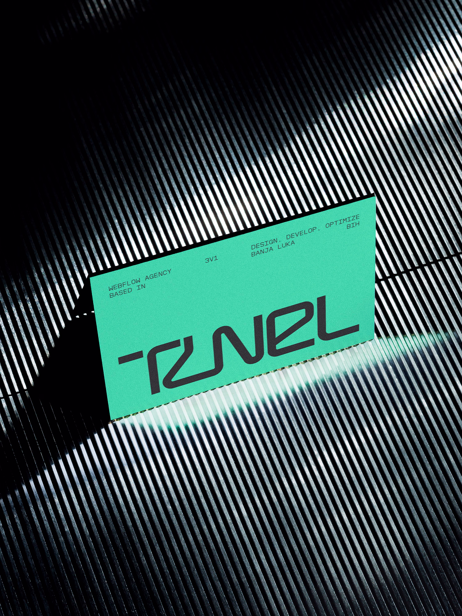
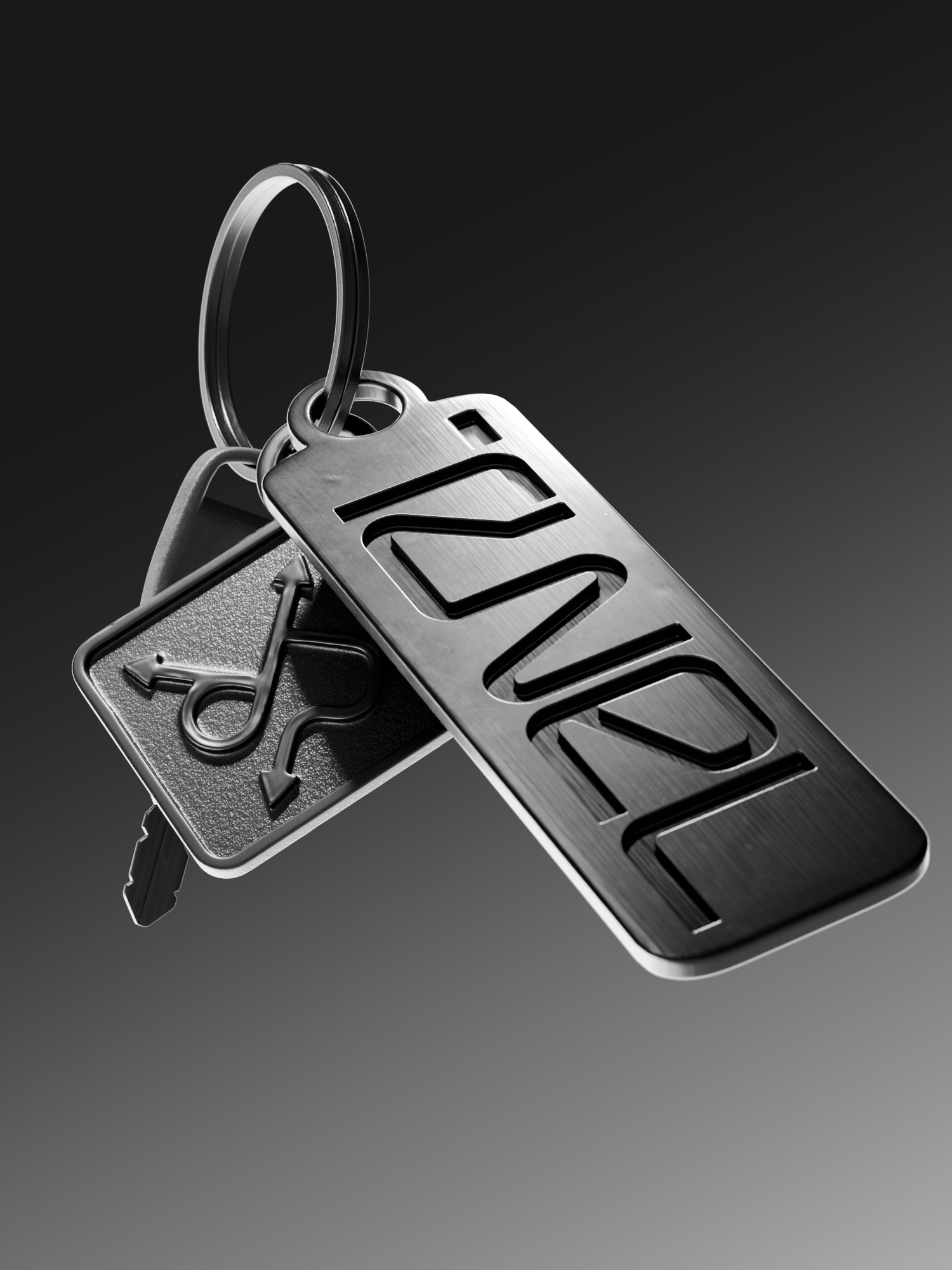
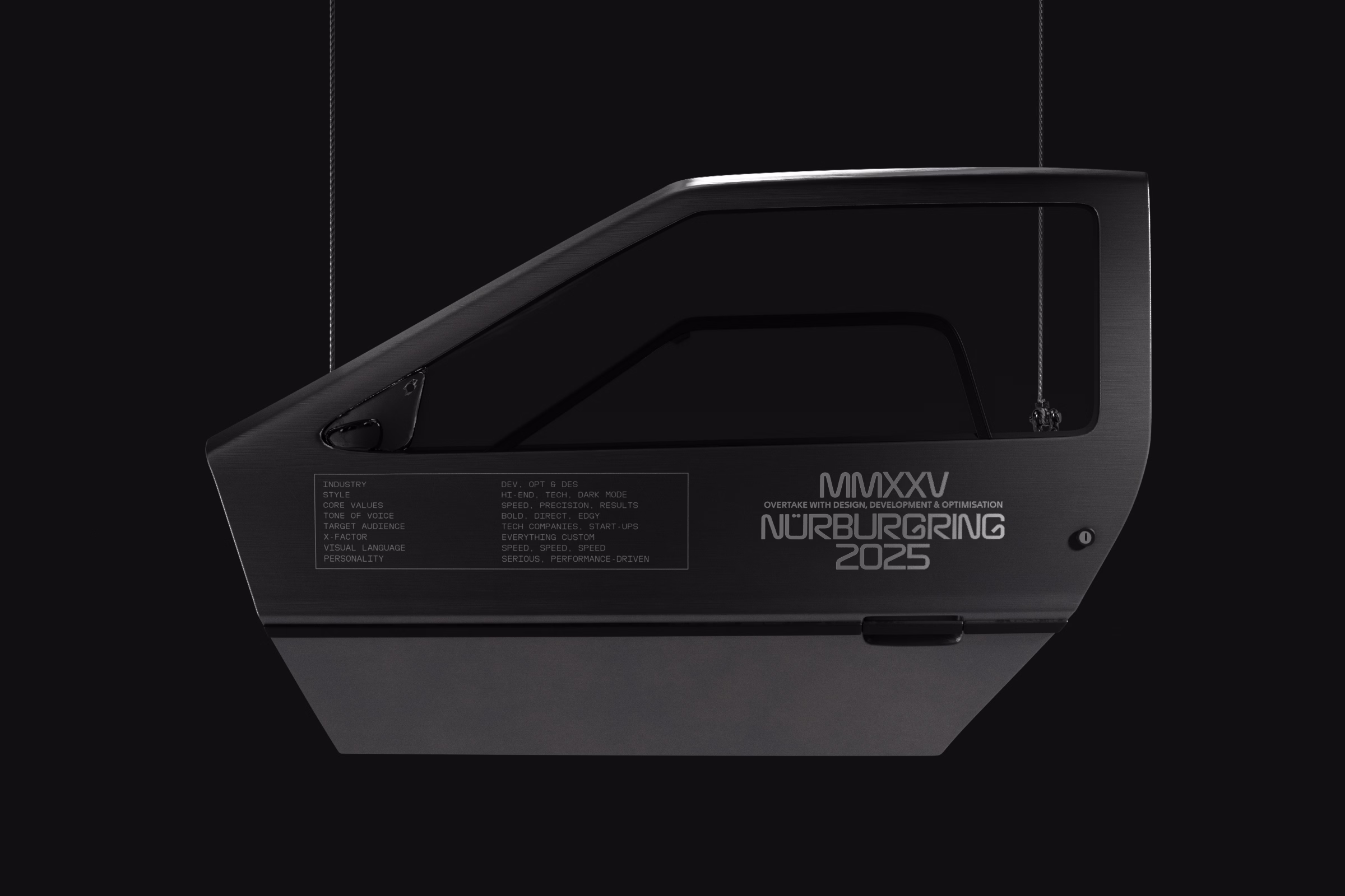
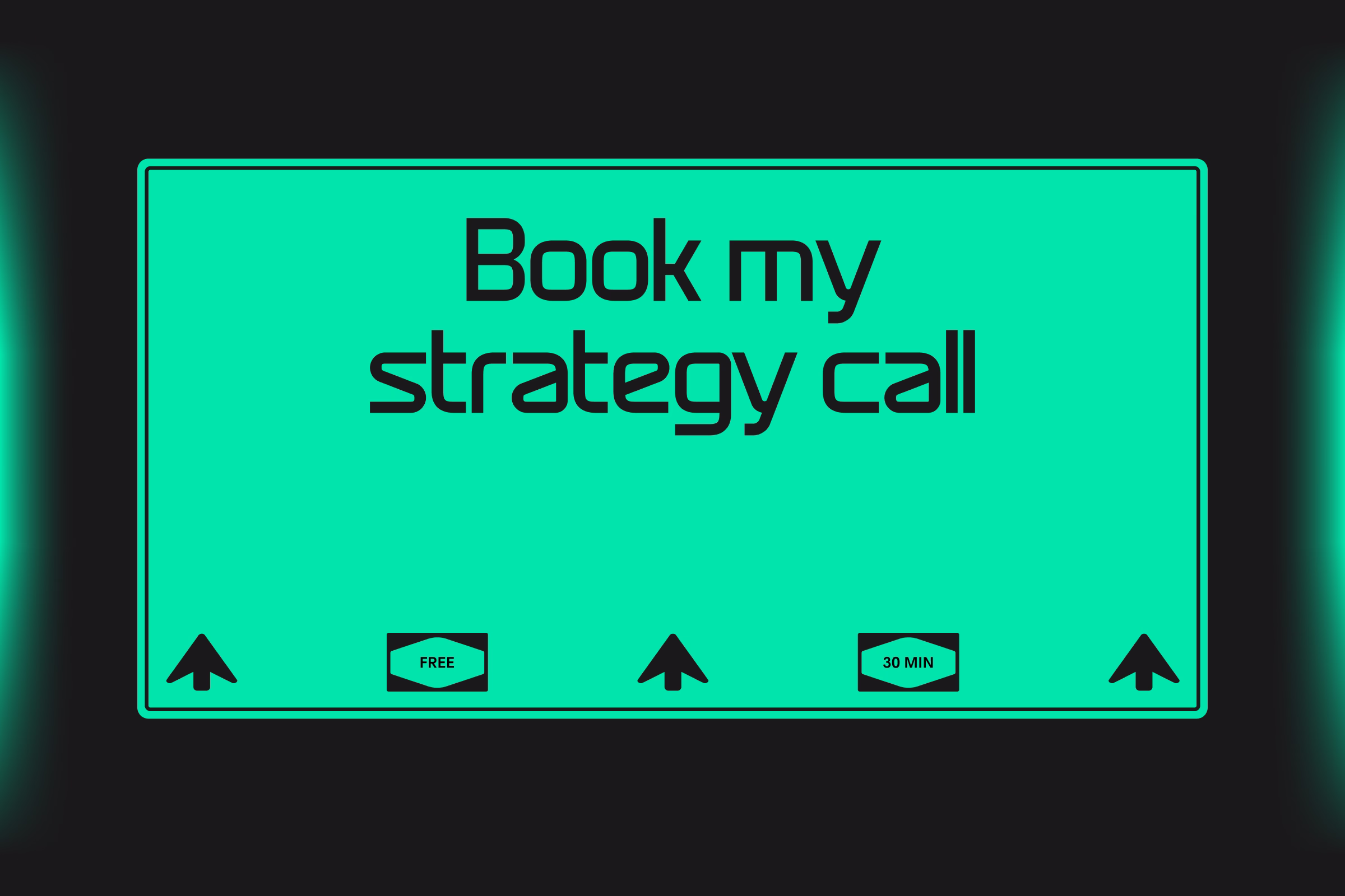
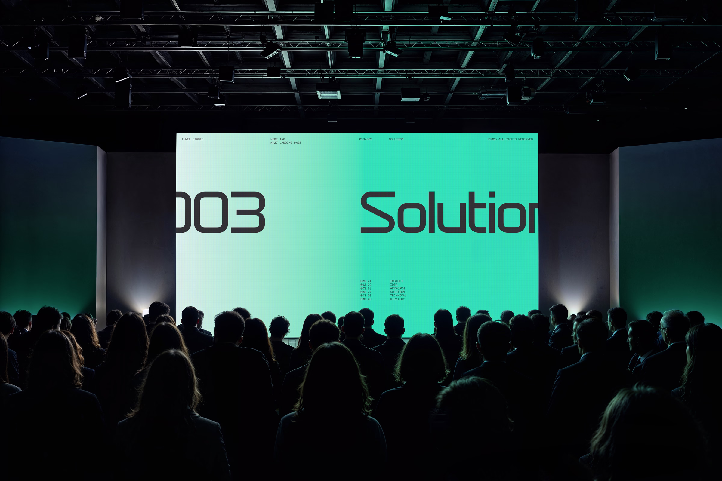
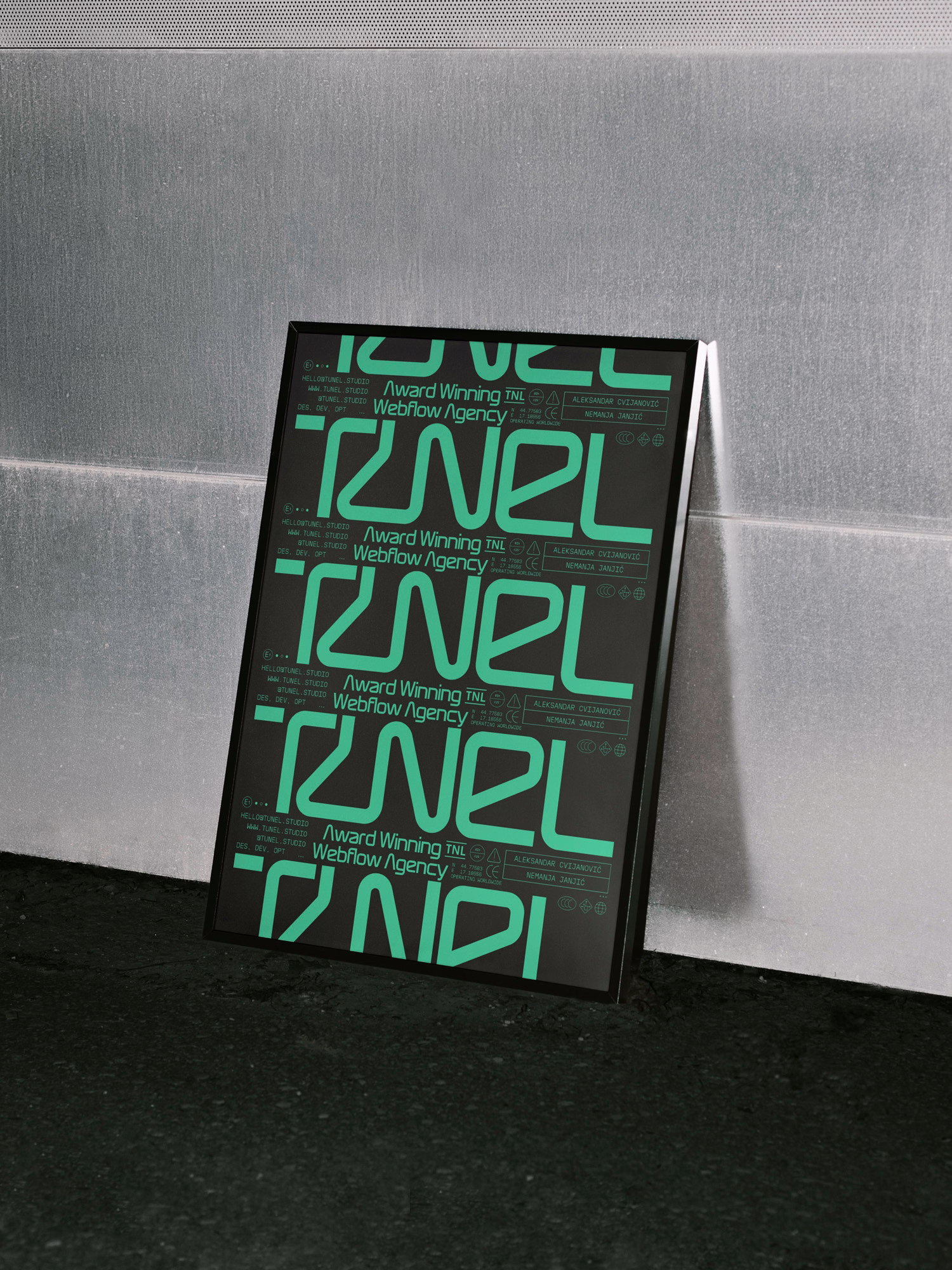
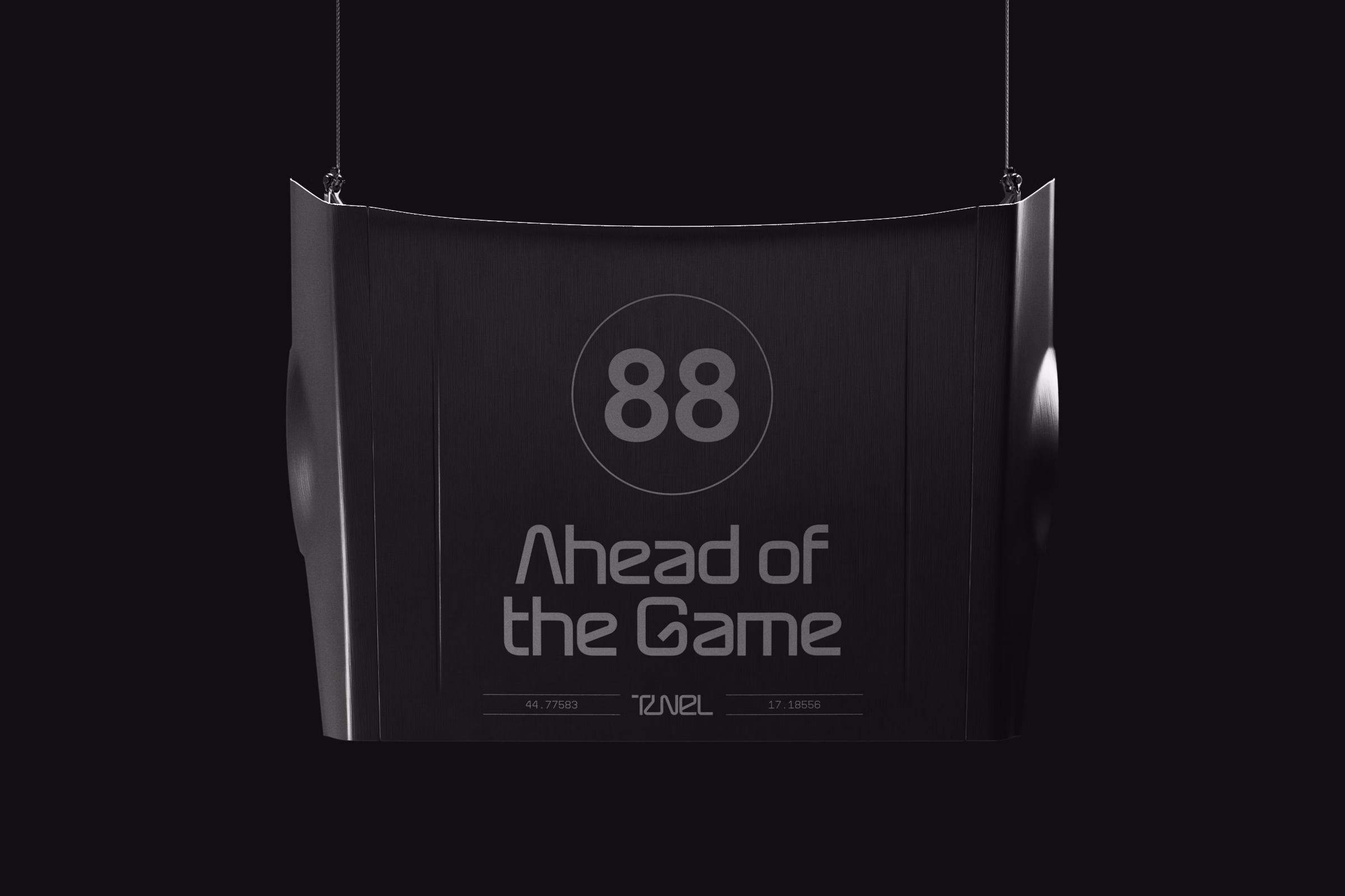
Identity That Moves as Fast as the Brand Itself.
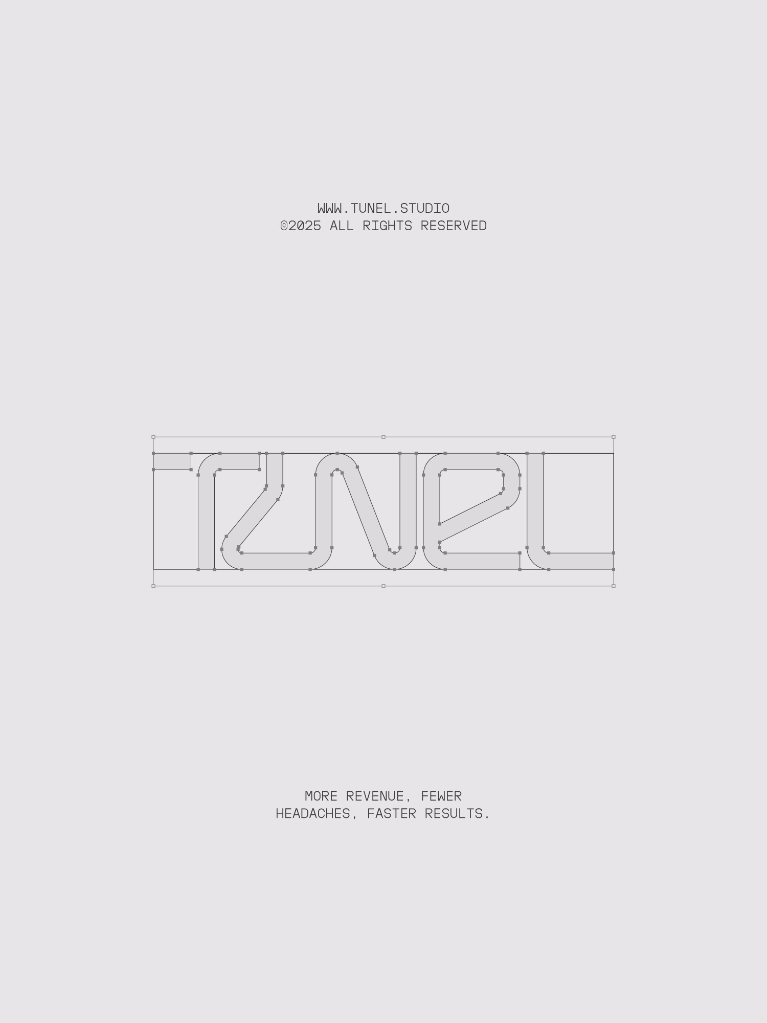
From this foundation, we built a flexible visual system rooted in the world
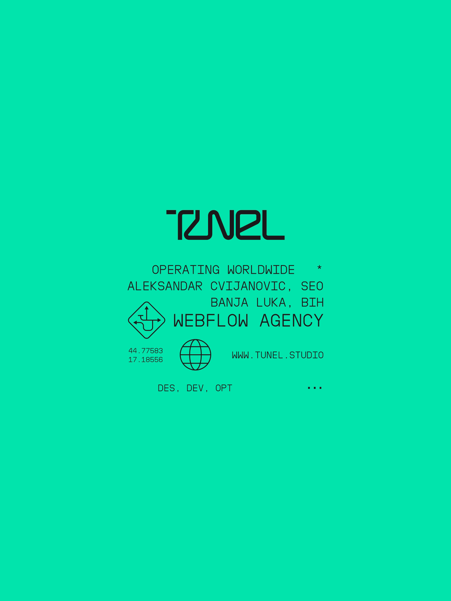
of performance and motion. The custom logotype takes inspiration from racetrack layouts, creating a distinctive and dynamic yet perfectly legible mark. The typographic system follows a clear hierarchy, combining a bold, tech-inspired headline typeface with a clean geometric sans for readability and a monospaced tertiary typeface for technical precision. The dark-mode foundation reinforces Tunel’s developer-focused DNA, while the neon green accent, inspired by the “go” signal of traffic lights, adds energy and symbolizes motion, growth, and progress. Together, these elements form a brand that feels fast, functional, and fearlessly modern, reflecting Tunel’s commitment
to precision and performance in every detail.

.avif)